
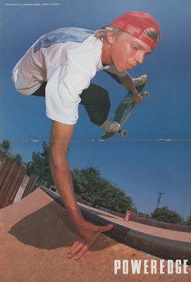
 |
| photo: jeremy wray |
One of my favorite artists in skateboarding history, I’ve always found it funny that Blockhead didn’t even know you drew when they first sponsored you. That you started out as just another teamrider who went on to reinvent their entire look.
Yeah, it was a pretty weird transformation to go through. I first met Dave Bergthold at the Sacramento Tower Books contest. He was throwing out stickers with his friend, Dave Hayes, in this cool ‘60s James Bond car they had. I'd seen their ads before and knew they were from outside Sacramento in Roseville. And it looked like he listened to Devo and the Specials, so he must be cool. I talked to him a little that day.
Three months later, I was supposed to skate a demo in Stockton with Sam Cunningham, Rick Windsor, Randy Smith and Mark Gonzales at a shop called “California Skate”. Dave ended up giving me a ride so that I didn’t have to depend on Sam and those guys… because while they were the cool, older guys from downtown, they weren’t always the most dependable. So yeah, I climbed into the Blockhead van and skated all day with those guys. The entire course was just curbs and jump ramps, so it was pretty cool. And Dave ended up asking me to ride for Blockhead that day. Summer of ’85.
But yeah, Dave had no idea that I drew or anything at first. I was just a teamrider. Their little street skater kid. That was it.
I started going up to Roseville after that, back when Blockhead was out of Dave’s parents’ garage. Just hanging out at Dave’s house, getting to know him better. He had a mini-ramp in his backyard, too. And over the course of all this, Dave found out that I was actually a commercial artist at age 16 and had been working at a food marketing agency.
 |
| Early Blockhead Ads featuring Ron. |
Yeah, tell me about your food agency stuff. What kind of products did you work on?
I would say that agency stuff is my core foundation in all this, because that’s really all I knew. I started at Park-Smith Marketing in downtown Sacramento and then transferred over to Buckles Design Group, who did a lot of food labels. Everybody was in their 30s or 40s and here I was, 16 years old, working after school. Just this weird little kid. But yeah, all commercial art. Laying out boring Pop-Tart boxes and stuff like that.
For the longest time, we did Marie’s Salad Dressings. I drew a covered wagon for some ranch dressing and strawberries for the strawberry glaze. And they stuck with those illustrations for, like, 20 years! I used to trip on that every time I went to the grocery store.
But that was my earliest professional experience, and then I started riding for Blockhead, which was all pizza and beer parties. Dave was a skateboarder, so he was always tempted to go skating instead of working. It was a totally different, totally bohemian way of working and I just ran with it.
How did you start doing graphics for Dave?
One day at his house, he brought out some paper to his kitchen table and goes, “Let’s doodle.”
I started messing around and I guess he liked what I did. After that, he kept asking for more stuff and eventually asked me to help him on Sam Cunningham’s second graphic.
 |
| OG Square on the Left, Later Psychedelic Square on Right. |
Didn’t you come up with the OG Blockhead square logo that night?
Yeah, just doodling. I liked it okay but felt that it still needed some work. I remember showing it to Dave, expecting him to say something like, “Yeah, I kinda like that. Let’s clean it up now.”
I was ready to get out the black Formaline tape and Exact-o Knives, you know? But Dave’s like, “Oh no, this is great! We’re just gonna use this sketch!”
“What!?!… Uh, okay. I guess that’s kinda punk rock, but it could be better!”
I knew some of the letters weren’t quite right in places, but he just ran with it. Skateboarding efficiency. (laughs)
Do those imperfections drive you crazy or do you kinda like them now?
50/50. In the back of my mind, I still want to fix them. But with so much time having gone by, you just have to accept that it worked and move on. Plus, sometimes if you go back and fix things, it takes all the energy out of it. Suddenly, it feels static and stale. Too perfect can make things feel almost synthetic.
But being asked to do Sam’s graphic was a big deal because he was the top guy in Sacramento at the time. The fact that Dave sponsored Sam Cunningham made Blockhead a legit company in my eyes. And now I get to work on his graphic? Cool!
I was excited to explore this artistic side of things because I always wanted to start my own company, even back then. I’ve always been heavily influenced by Tony Alva and Tom Sims having their own companies. To go pro and start my own skateboard company like those guys was basically my dream since junior high. So when Dave asked me to help out with graphics, I couldn’t help but take over everything because it felt like my only chance to have a skateboard company, even if it was technically Dave’s. I’m kinda stealing Blockhead from him, but he keeps asking for stuff, so here I go! Plus, I also thought that by me doing this extra stuff, it would be harder to cut me from the team. It would legitimize my sponsorship and give me a stronger position in the company.
 |
| Sam Cunningham |
For Sam’s graphic, Dave took a lot of my elements and put it all together along with this repeating grid pattern that he was into at the time. It was definitely a collaboration, which is why it looks a little disjointed. But after that is when I started doing full board graphics on my own.
The first board that I ever did on my own was the first Jim Gray model in ’86. The real paint brushy one. And I remember feeling so much pressure about it. Like, oh my god, this graphic is gonna be seen all over the world! And it has to represent Jim Gray! He rode for G&S and was in Skateboarder Magazine! This is a big deal! (laughs)
I came to the realization that I needed to give this graphic a new look. Because Dave already had a look going for Blockhead, but it was still based in the early ‘80s, like Devo and the Specials. I mean, even when I first started doing stuff, I was just kinda emulating John Lucero and Jim Phillips. Old punk rock covers, like the first Clash cover, because I just didn’t know what else to do… but no more. I knew that I had to give this board a new look that was fresh, but still worked in skateboarding.
 |
| Jim Gray: Ron's rider with OG inspiration on the left. |
Where does the graffiti influence come from?
I lived a half-mile from Tower Books in Sacramento, which got all the cool underground stuff. In 1985, they got in a book called “Subway Art” and it blew me away. All of the lettering and characters. It was just so colorful.
My whole thing was always trying to figure out what was cool but weird. Like, what was so “out” that it was kinda “in”, you know? And to me, that was the psychedelic ‘60s stuff, I just didn’t know much about it. I was always trying to find out more about that world, and a lot of the lettering in that “Subway Art” book was very similar to the psychedelic style. So yeah, it wasn’t too long after that that I became a fake b-boy. (laughs)
I started messing around with my friends, doing murals in the middle of the night. Trying to emulate what was in that book.
Dave wasn’t really down with hip-hop graffiti or rap yet, which became a frustration for me. He was more into old-school punk and new wave at that time, which meant that I basically had to sneak graffiti into my graphics without him really knowing. That’s why there weren’t any full-blown graffiti Blockhead graphics, which I think is how we ended up with such an amazing blend of things. You can tell that things are influenced by graffiti but it’s not just that on its own. A lot of my early stuff was basically trying to cobble together different things to create something new, like graffiti and psychedelic ‘60s posters.

Yeah, he was one of my favorites. Just that whole San Francisco poster art scene in the late ‘60s. All the underground comics from that era, too, like R. Crumb. That whole attitude. I wanted to somehow cram all of that into my graphics.
We wanted to have the best looking graphics at Blockhead, but we also knew that we couldn’t compete with Powell. They were, like, the big leagues. So we actually started trying to do the opposite of Powell in many ways. Making things that the bigger companies couldn’t, because that was our only chance. We were just a budget company from Sacramento.
I feel like my graphics really started to change around ’88 or so when I started to feel some actual responsibility in all of this. With so many people seeing these boards, I started wanting to imbue some kind of ancient knowledge and curiosity into my work. To where people would question what some of these graphics actually meant. Mysticism-kinda stuff. Like, what’s that symbol mean? Not too much, but I did want the graphics to have a deeper meaning than your typical stuff. Like, I never wanted to make a graphic that was just an explosion with some lettering. Or skulls… Not that we could do skulls anyway, Powell owned skulls. Zorlac had Pushead, which meant even more skulls. And then there was Skull Skates. There was no need for any more skulls after that. Even if I got asked to do a skull graphic, I'd always refuse, because that wasn’t Blockhead. We were on this other path.
 |
| Ron Cameron is a centerfold. |
I think that’s why your graphics have aged so well, because they’re not so knee-jerk. They’re always so wide open to interpretation.
That happened through music and trying to figure out what psychedelic was. I would go to the used section in the record store and desperately search through everything, trying to figure it all out.
Because you start out with Hendrix, Dylan and Donovan. And Donovan was one of my favorites because he had that weird mystic hippie vibe. He had a few super colorful record covers back then, too, and I remember finding those, like, “This is it!”
Then, you start listening to Love and realize that they were all about open-mindedness and asking questions. Putting mysticism out there and making people realize that there is a higher level you can get to. Let’s get there, dammit.
But what you said is funny because I actually thought my graphics were time-coded. That this was the best graphic I can do right now, but six months from now, it'll be dead in the water. And at that point, I’ll have to come up something new and fresh again, whatever that will be. I’ll just have to keep expanding as skateboarding continues to evolve.
 |
| Ron actually skated for Vision Blurs but I love his Wild Things drawing anyway. |
What was your typical process with graphics back then?
Well, I was still living in my mom’s apartment when I first started at Blockhead, so I would typically use our little coffee table to draw on while watching cartoons. Usually in the evenings or on weekends when nobody else was around. I found that butcher paper had a nice clear coat on the back of it. This was before they actually sold it so I just got it off the roll from the butcher in the meat department. It was 14 inches wide, so I’d always have to cut it down to the size of the board.
I’d try my hardest to make it all self-contained on one piece, inking it all on that with some whiteout corrections. It didn’t always work out so I’d have to redraw things on little pieces of paper and then glue those on top with rubber cement. That or Xerox machines and Stat cameras if I needed to enlarge or reduce things.
I tried to stay away from doing black outline artwork… just doing an all-black outline and filling it in. I always wanted there to be elements of “other” that were often hard to register. This was harder to do but it looked more interesting to me.
Generally, there would be one or two main layers on two separate pieces of paper, so I would have to hand draw the registration symbols. I didn’t have a light table so I’d hold the pieces of paper up to a window in order to check everything. And then, with the other parts that were just fill, I’d get that rubylith film stuff. The clear mylar sheet of weird rubbery red stuff that you cut, removing the area that you didn’t want to be the ink area.
It was a combination of hand drawing, Xerox and Stat camera… fortunately, the marketing agency I worked for had a Stat camera, so I just used theirs. But it was always a kind of cobbled composite, which now that Dave is trying to reissue these boards, there have been some difficulties. A lot of the rubber cement pieces have fallen off over the years and gotten lost. He can’t just go in and recreate these graphics so easily. It was that homegrown.
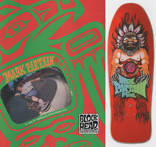 |
| Mark Partain |
What graphic took you the longest?
I don’t know what took the longest to draw, but that Mark Partain board with the Indian was probably the most complicated. Because Dave’s friend Dave Hayes was obsessed with Steve Alba and Santa Cruz at the time. Santa Cruz was doing these elaborate screened boards in ’87 and Dave H. really wanted something like that for Blockhead. I remember him always pressuring me about it whenever we went skating.
So I gave it a shot, intentionally trying to make it look like Santa Cruz with these layered fluorescent inks. All outlined. That took a lot of time because it wasn’t exactly my style. It was me trying to look like something else. Not totally pure, but it did come out pretty good. It was just a struggle getting there because I still wanted it to look a little like Blockhead while still playing off Santa Cruz’s style at the time… which is why Dave later named a board we did “Neon Circus”. That’s what we thought all of the Santa Cruz boards were starting to look like after a while, a neon circus. That was us poking fun at Santa Cruz.

How many inside jokes are hidden in these things?
Oh, there are a lot. Because that’s how I tried to get people to think, by throwing in all of these elements. Sometimes, it was just a word. Like, I remember throwing the word “plastic” into a graphic. To me, it represented phony people and businessmen. That fake Top 40 world. I don’t know if other people thought that as well, but by throwing it in there, my hope was that someone might see it and wonder, “Why the fuck is that in there? What does that mean?”
Whatever they came up with was fine, I just wanted people to think and feel more. Let’s elevate to a higher level of existence. And let me see if I can help bring that about… through skateboarding. (laughs)
But there’s a ton. Like Jim Gray’s graphic, I put a ’63 Ford Falcon in there, the first car I ever owned, just because.

What about Hard Times? Essentially a price-point deck, why do you think that caught on the way it did?
We were going through a recession at the time and the industry was talking about raising the price of decks. I think Powell was starting to dabble with price-point boards, and then Dave got into it, too. Maybe our board sales were dipping? I don’t know, but that was Hard Times. Natural boards, no stains, no paints. One color only.
It was Dave’s concept, initially. And my first reaction was that I hated natural boards. They always reminded me of the ‘70s and I felt like we’d gotten so much further than that. Give me some dyes! But the more I thought about it, the more it became a challenge. The whole premise sounded so shitty to me, I’m just gonna make this as shitty as I possibly can on purpose. Because I’m frustrated but also because that’s kinda punk rock, too.
I drew that artwork super small. Maybe two inches tall, maximum, with a ballpoint pen. Just a regular Bic ballpoint pen. And then I just kept enlarging it with a Xerox machine over and over again. Repeatedly, to make it really bold but also super shitty looking. Like a kid just took a marker and did this graphic real quick. I wanted the whole thing to look totally haphazard.
The term “Hard Times” came from JJ Rogers and his crew from San Leandro. We sponsored JJ, which also brought along this package of guys, like Jay West and Joe Lopes. It was like they had an entire culture of their own at the time. It was hilarious. They were from the ghetto, but a different type of ghetto than what we had in Sacramento. And they all had their own lingo. “Hard Times” came from that because they were always broke. Like, Top Ramen with ketchup? That was “Hard Times Spaghetti”. They had a million things like that.
This was also when the dirtbag look was starting to become popular in skateboarding. Skaters in San Francisco were starting to wear Ben Davis and Dickies, basically trying to look like an old man bum. So that’s why I went with the bum for that first graphic.
And the weird hat that he’s wearing actually came from Ross Goodman. A lot of people don’t know that we sponsored Ross back in ’86. Blockhead was his first sponsor.
 |
| OG Hard Times Sketch |
I didn’t know that.
Yeah, he was gonna have a pro model at one point but it didn’t work out. That’s how Dave’s design board came about. The one with the barcode over the face? That was supposed to be Ross’ graphic but then he went on a different path. He got all into Samhain and suddenly Blockhead wasn’t cool enough, so he quit.
But yeah, Ross was all into evil stuff, playing around with Satanism and stuff like that. And he came up with this guy… he drew this evil old man character with a garden hat on that looked kinda witch-y. I always thought it was cool so I drew from that for Hard Times as well.
As you can tell, these graphics are always a combination of things that come from whoever you’re hanging around. Just these little fragments from your friends that are floating around. From the outside, it probably looks more unique than it is, like I invented something, but it’s really just all cobbled together in an entertaining way.

How'd JJ and crew react to those boards coming out?
There was a little animosity. Not much, but there was definitely a feeling of, “Hey, that was our deal and now you’re capitalizing off of it.”
Honestly, I feel like that probably led to JJ quitting shortly after that. Because we were gonna turn him pro, too. We gave him that ad with the first smith grind down a handrail at School XYZ or whatever in San Diego. We were designing his board when, out of the blue, he quit to ride for Dogtown. That board ended up becoming Sick Sense.

Oh, wow.
Yeah, the lady in the martini glass was based on a shirt I did in high school for my friend’s band “Mickey Finn”. Dave just happened to like the drawing and wanted to use it for a graphic. I added the crazy guy and made “6 Cents” look like a racecar thing, because I was getting more into that at the time. I gave it some crosshatching and some typical Blockhead lettering, too… but honestly, I’ve never been so sure about that one. It was never meant to be a graphic, it just became one. Because I would’ve never drawn that weird Pamela Anderson-looking model in a martini glass for Blockhead. I just don’t think it fit.

What about the Good Sam Club?
Good Sam Club was a pretty big RV club at the time. Whenever we’d go out for demos in the stinky Blockhead van, we’d always see those stickers at rest stops. And with Sam being one of our pros, we were always making jokes about it. Eventually, Dave had the a-ha moment to use it as a graphic but with Sam’s head in there from his second graphic. That it might look cool, kinda like the Santa Cruz red dot.
But yeah, that was Dave’s idea, I just helped put it all together, including the fake Sam Cunningham signature.

Omar’s sultan?
All the Omar stuff just came from his having a unique name in skateboarding. I guess it’s a Persian or Yemen name? I don’t know but people used to trip out on that, which is funny because he’s totally just an Orange County kid. But again, that was a bunch of elements. Because I wanted to play off this Persian idea, I went back to the Warner Brothers cartoons of the ‘40s when Bugs Bunny and Daffy Duck went to the Middle East. I remember them wearing those clothes, which is what I based the idea off of. Super schlocky and stereotypical, but I thought I could make it look cool.
Omar loved John Lucero. And at the time, Lucero had that red cross graphic going. As a nod to that and trying to give Omar what he wanted, that’s why his first graphic has the square border. It was my tip of the hat to John for not stealing Omar as well as my own way of telling Omar that I’d figured out his deal. I’ll let John have a piece of your graphic on this Blockhead board.
The lettering was influenced by an album cover by this reggae band, Israel Vibration. They had just released an album that had that same style lettering in a circle and I thought it looked psychedelic cool.
A lot of graphic elements come from record covers, actually…
 |
| Omar Hassan and Inspiration |
Like what?
Oh god, so many. Even the names of companies. Like, after Blockhead, I tried doing this company called Sector 3. I was obsessed with Spacemen 3 at the time, which I felt was like a modern psychedelic band that nobody knew about. Sector 3 was directly named after Spacemen 3.
And with Acme, I was also trying to do Strike along with it… basically as a way to do 100% my own designs. Because when I partnered with Jim to do Acme, I knew it had to be 50/50. It also had to represent Jim’s vision, even though he’s not an artist. So, of course, that got frustrating at times, which is where Strike came in.
…Until he canned it. (laughs)
But anyway, Strike was named after both that counterculture ‘60s movement of people “going on strike” as well as the Clash’s “Lightning Strikes”, the hip-hop song they had on Sandinista. I just kept hearing the word “Strike” and thought it would make a rad company name.
One record that really helped define the early Blockhead psychedelic lettering was by this band called “The West Coast Pop Art Experimental Band”. I think it was their first album, which had an orange cover with blue hand-drawn lettering all over it. Nobody would know about that album but it was a big influence.
 |
| Simple Simon |
I love Simple Simon, but what are you saying there?
Simple Simon was basically supposed to be my model, without really being my model. Dave had done one for himself, too. Not a “Pro Model” but “A Ron Cameron Design”…even though everyone still thought it was my model because it had my name on it. It actually caused a bunch of problems with CASL and the NSA. All of a sudden, they wouldn’t let me enter amateur contests anymore.
But yeah, I worked a long time on that board. Because I didn’t want the graphic to look like anything else out there, but it also had to represent me. My style of skating. And I got to do the shape, too. It was a lot.
Simple Simon was my first racing stripe, which was sorta scratchy towards the nose and punk rock. And I love things that are upside down because it automatically looks different and makes you think differently, too. It does come dangerously close to a rip-off with the Neil Blender-style face. I had kinda developed that style on my own but it obviously came from what Neil was doing. I was just so amped on his stuff.
With the flames, I just wanted some psychedelic blobs. I’d already started developing my own psychedelic patterns by that point, but I also wanted to blend it into flames because I was always into drag racing and custom car culture. I didn’t want to ditch that. And whenever I would skate with Mark Gonzales, he’d often have flames painted on his griptape… alright, I guess flames are okay! (laughs)
I always liked putting flames near the back foot. It was almost a superstitious-type of thing, like a hot foot for your pop foot. If that foot was all heated up and on fire, then you’re gonna skate even better! Just weird psychological stuff.
So yeah, between the racing stripe, Neil Blender, flames and psychedelia, I had all my bases covered. This was the perfect graphic for me.

Why’d you name it “Simple Simon”?
I probably heard it somewhere and it struck a chord. At the time, I was trying to boil everything down to the cold harsh facts. Simplifying it all down to the nitty-gritty. And I thought “Simple Simon” was a fun way of getting to that point. Unfortunately, everyone started reciting that “Simple Simon” nursery rhyme to me and I got really sick of it. That’s why I titled my next board “Tragicomic”, which I got from the liner notes of a Jimi Hendrix record cover. But then everybody started calling me “Tragicomic”.
It’s funny because when I started doing ollie blunts, which nobody had really seen yet… I actually thought I invented that trick. But everybody at the Coffin Banks in Sacramento used to call ollie blunts “The Tragicomic”. And, of course, I got all worried, like, “Oh no, now they’re mocking this board, too!” (laughs)

You’ve called Tragicomic your most personal graphic, how so?
Because it was 100% me again. No collaboration. I didn’t have to work with Dave on the shape or any of it. It was whatever I wanted to put out there. Like the Simple Simon, but I’d gotten better at it.
I actually thought that I was going pro with that board, which obviously didn’t end up happening. That was a weird situation. Because with me doing all of these graphics as well as my skating and being in the ads, I thought it would be enough to put me over. Because I truly thought I was ready. That my skating was on that level.
 |
| Early Tragicomic Sketches |
I mean, skater/artists going pro was kind of the Vision model back then, with Grigley and Lucero.
Yeah, I actually modeled myself after those guys, to an extent. It just never worked out.
Is that character with the pan on his head supposed to be you?
No, not at all. That was when the whole “slacker” thing was starting to materialize, although it didn’t have a name yet. This was before the movie, actually. It was after punk rock but that ethos was still floating around. And again, that was me tapping into the whole ‘60s burnout culture. Misunderstanding the ’60’s burnout culture… because with punk rock, we were all supposed to hate hippies, right? But all of a sudden, I’m embracing hippies? And all the Rastafarians who kinda look like hippies, too? People weren’t having those guys either.
I just had all this stuff swirling around in my head, so I ran with it. Sorta mocking it but embracing it at the same time. To me, the empty pot on that guy’s head is about walking away from society. Consumer culture, corrupt politicians and corporations polluting the world. All that stuff. Coming up with that character was my attempt at saying no to that. It’s basically an end-of-the-world look. Walking off in the other direction.
There’s a Ross Goodman influence in there, too. Because Ross was hilarious and used to come up with all of these insane ideas. Like, back in ’86, he came up with this idea of just giving up. “Yeah, man… just give up.”
Go and lay on somebody’s front lawn. That’s your new home. And if they try to move you, just don’t move. Who cares? Just give up, man.
Why the recurring themes of eyes and keys?
Well, eyes were a big thing in psychedelic poster art, so I gained a better appreciation for them through that. They became this weird and mystic thing to me. But then I’ve also found that the eyes are more communicative than anything that anyone actually says. To me, you can’t lie through your eyes. Like, how people say the eyes are a window to the soul? There’s a truth there.
The keys are always keys to hidden knowledge. To secret wisdom or enlightenment. Nirvana. Again, a way to elevate the human species… through a fucking skateboard company. (laughs)
It was an icon that I liked to use to help people think. And by the time I got to Tragicomic, it had a specific meaning. With the hand reaching for the key, that was my searching for the key to enlightenment. Elevated thoughts.
…And they’re just an interesting object, too.
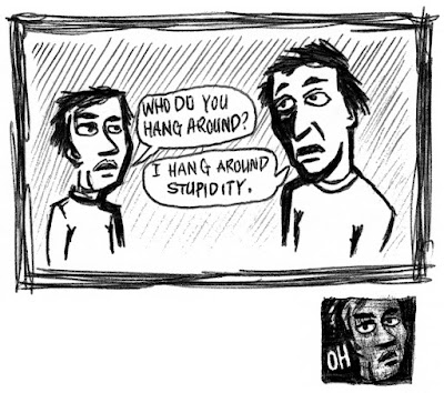 |
| Original Version of "Nothing Is Cool" |
Wasn’t “Nothing Is Cool” just a throwaway doodle?
Yeah, I doodled obsessively back then. I was still in high school and all the margins of my binder paper were covered in doodles. Suddenly, I was riding for Blockhead and doing graphics, I remember thinking how important it was for me to keep doing that. To do more.
Nothing Is Cool is actually something I started messing around with in 1986. I was obsessed with high school and popularity… just how weird and twisted it all was. Like, cool kids and misfits? What the fuck is that? But yeah, it was those two faces. One said, “Who do you hang around?”
The other one said, “I hang around stupidity.”
And the first one goes, “Ohhhhhh….”
To me, that summed up high school.
But then, I came up with a second version using the word “cool”. Again, two people talking. The hippie burnout guy and this old businessman-type of guy… he was just like a pedestrian or something. Somebody who knew nothing about skateboarding or whatever was cool in the world. And at that point, I was so sick of everybody saying “Hey, what’s up?” This was everybody, not just high school anymore.
“Hey, what’s up?”
“Oh, nothing.”
So I wondered what it would be like if I replaced the word “up” with “cool”.
“Hey, what’s cool?”
“Oh, nothing.”

That sounded funny to me. Maybe I’ll make a bumper sticker out of it? It seemed to go against everything in high school, because that entire thing was just about aspiring to be cool. To wear the cool clothes and fit in.
This was me giving up. A total blurred line back to that Ross Goodman philosophy. Learning to become nonconformist and not succumbing to peer pressure, which 90% of kids can’t even think of a life without peer pressure. Like, you can’t go against peer pressure or you’ll die. But the thing is, if you reset all that stuff, you’ll actually set yourself free. It frees you from having to worry about all that “acceptable” nonsense. So, to me, that drawing represented freedom. I’m letting go of all that. Fuck you. (laughs)
I originally drew it in on a shipping table at Blockhead. I used to do that a lot back then, like a secret focus group. And boy, did it get a reaction.
“Did you draw that? That’s so fucking funny!”
Everybody loved it, which actually was cool.
I remember Dave being like, “Yeah, it’s really funny, but what do we do with it?”
Because it’s not a skateboard graphic, at least not back then. It didn’t say Blockhead. It doesn’t even advertise anything. It’s just this weird bumper sticker. Luckily, I happened to be working on my Simple Simon board at the time, so I just slapped it on there as a top graphic. Upside down, of course… basically as a fuck you.
From there, all of the riders ended up seeing it. They started telling Dave how much they liked it and that we should make stickers and t-shirts with it. But for whatever reason, I got super protective of it, like, “No! That’s my top graphic! That’s mine!”
I was just being insecure and precious about it. But after a year or so, after we all moved down to San Diego when Larry Balma’s Tracker Distribution licensing deal got involved, I finally gave in and let Dave make some stuff with it.
I never thought people would like it, but people really wanted that thing, man. It was wild. And after that took off, I started to think even more about doing my own company, without Dave. The seed was planted. So when Blockhead sorta merged with Tracker and things turned out the way it did, I left and tried doing Sector 3.

I can’t imagine that being an easy decision for you.
Oh, it was basically like a divorce. Super traumatic to go through. But the Tracker thing was just way too restrictive. Like, they hired this real estate marketing lady to manage the art agency at TWS that I “worked for”. She wouldn’t even let Dave come over unannounced to meet with me and brainstorm. And then they hired this other older guy who was, like, a motivational speaker? Neither of them knew anything about the core skate market at all. I guess he was supposed to oversee all of Larry Balma’s companies. The guy started denying all of my graphics!
“Oh no, we can’t run this.”
Like what?
One example would be my wanting to make a Blockhead zine. I wanted to call it “Dope Zine”, because it felt like a fresh slang word to call it and I also liked that it could have several different meanings. It came from hip hop culture but could also mean a stupid person or even something like “information”. The straight dope. It was perfect. And Dave was fine with it, too. But this guy could only see it as meaning drugs. That was it. Nothing else.
We were able to get the first issue out but while I was working on the second one, the guy cancelled it. Dave fought for it but the guy wouldn’t budge. He just didn’t get it and he had all the power! There was nothing I could do.
It was just blow after blow. Like, what is now called “The Grumpy Man” graphic? That was taken from a sketchbook of mine from years prior, because Dave wanted to make it a team board. So I took my original drawing and put all of this enlarged typewriter font stuff in the background. Just words that a grumpy old man would say to skaters in the ‘80s. There weren’t any blatant cuss words in there, but this guy still went through and censored a few words out of it anyway, which meant that I had to do the whole graphic over again. Even Dave was like, “I know there’s nothing wrong with it but they say we have to change it.”

I know it wasn’t just me. He ruffled a lot of people’s feathers there. Let’s just say that he’d never approve of 95% of the graphics that would be coming out in the next few years. I guess maybe Larry was hiring older people to manage the day-to-day aspects of all the companies so he could focus on his vision of everything. The big picture.
It just wore on me. Because when we merged with Tracker and moved to Southern California, I was told that I’d have my own office with a door. Drafting tables and posters and toys. That it was going to be the Blockhead zone inside there. The creative hub of Blockhead was going to be Ron’s design room. But the way it worked out: Dave and I had offices for exactly 24 hours and then they took them away. Dave didn’t even end up having an office and it was his company! They put him in an open cubicle with the Tracker team managers.
It’s not like I was really getting paid well, either. I could barely make rent! I kept hearing that there’s money to be made in skateboarding but I never saw it. Maybe if I had my own company, I can actually make some money and even have health insurance?

That's how Sector 3 come about?
Yeah, Noah Salasnek approached me one day. He heard about my leaving Blockhead and that I wanted to start my own company. He wanted to introduce me to an investor guy in Sacramento who was looking to get into skateboarding.
“Okay, I guess this is how it works. I need to work with an investor.”
Because I always felt that I could do a company, I just didn’t have the funding. I didn’t have the capital, just the ideas. I needed to find a partner with the resources, like my fantasy of the Stecyk and Stacy Peralta unit.
So I talk to the guy and we start incrementally setting things up. I run a 2/3 page ad in Transworld. O hooks me up with Screaming Squeegees in Huntington Beach to screen the boards. And I’m actually getting ready to sign a lease on a warehouse and move up to Huntington Beach… when suddenly, this guy calls me up.
“Hey, I got some bad news. My brother got in some legal trouble, so I have to use the money that I was gonna fund Sector 3 with to help get him out of this jam he’s in.”
“Oh… okay. I guess that means it’s over?”
“Yeah.”
“Shit!”
I immediately went to Transworld, like, “Hey, you know the ad I just turned in that I owe you guys $1,800 for? Ummm… I’m broke!”
But it was too late. They stuck me to it! I had to pay that ad off over the course of the next three years! They wouldn’t let it go. And that’s how I learned business. Like, woah, money is scary again.
Fortunately, I ended up running into Jim Gray at a mini-ramp contest in San Jose right after that. We discovered that we were both trying to start skateboard companies, maybe we should join forces? After all, he was calling his “Acme”, while I was going to call mine “Sector 3” with “Acme Wheel Company”. Similar wavelengths, you know? Because I was really into shoegazer music at the time and all those bands, like Lush and Ride, they had these simplistic four-letter names. Acme felt like that same kinda trip. Kinda weird and generic. Maybe we are supposed to do a company together? And that’s how Acme started.
I just felt like I needed a partnership with someone who I trusted, that could allow me some creative freedom while they managed the company operations... I mean, I knew that we’d still need to have input in each other’s areas for it to ultimately be successful. It can always end up being either a great marriage or a huge problem, but I had no problem being a naive risk-taker back then. (laughs)
 |
| Sector Three Ad #2 (Unpublished) |
Was there a conscious effort to make everything less “Blockhead-y”?
Oh yeah, which was very difficult. Because I left Blockhead strictly out of frustration. It wasn’t like I had this whole other vision. Sector 3 was essentially where I was going with Blockhead graphics.
If you saw the art for Sector 3, it was based around Spacemen 3 and a new modern psychedelia. And auto culture, like a lot of ovals and racing stripes. I found myself getting really into gears around this time, too, so everything was outlined with this weird industrial gear pattern. It’s too bad that nobody saw any of that stuff.
Sector 3 was basically my transition from Blockhead to Acme. A llttle more refined and corporate looking, but very devious. Like Vaughn Bode characters, weird space age references and ‘70s experimental culture, which I then started bringing into Acme.
One thing you have to remember in all this is that once we got into the ‘90s, there was a shift in the industry where graphics definitely got toned down. Everything started catering to these young street pros, who were all insecure yet egotistical somehow.

Example?
Just the whole movement. The “push, push, push, slow down and do a trick” guys.
I feel like it started with H-Street and Plan B. Catering to young pros, which is fine, but a lot of those guys didn’t have any real life experience. And a lot of them weren’t artistic, either. So, a lot of times, you couldn’t really figure out how to represent them with graphics, which is why ripoff culture got applied so liberally back then. These guys would have no idea what they wanted for a graphic, so they’d just point to different products and take whatever logos and characters from the label.
“Oh, you want something like that?”
“No, just take that.”
Because they’re comfortable with that, but then you’re no longer designing graphics anymore. You’re doing knockoff spoof stuff. Don’t get me wrong: It was fun, at times. But it wasn’t this creative burst like in the ‘80s.
I’m not putting down the ‘90s guys but it did go through a weird phase. Because in the ‘80s, you had to dress your own way and skate your own way. That’s what set you apart. That was your style and only then could you become pro. But in the ‘90s, it was suddenly the opposite of all that. It became completely conformist! Like, you always heard the word “cut”. That trick is cut. That hairdo is cut. Everyone was talking about how individual we all were but we all looked the same and had agreed to do the exact same tricks. It was just so serious.

Is that where Acme’s “no pro model” concept originated?
That was mostly Jim’s idea, but I understood where he was coming from. Because there was a specialness to pros in the ‘70s and ‘80s. You really had to work at it, which is why there were only so many pros back then. But around ’91 or so, when all of these skater-owned companies popped up, you suddenly had these guys that nobody had ever heard of getting pro models. Guys who’d never even entered a contest before. And I think that was Jim’s often misunderstood stance with Acme, that we needed to get back to where it was only the top of the top guys going pro. I just don’t think people quite understood that.
But even more than Sector 3, Acme was difficult because that’s when I really realized that I basically had to start all over again. That the style I had created over the last five years was so widely seen as “the Blockhead look” that I couldn’t really use it anymore. It was like my style didn’t belong to me anymore. So what the hell do I do now?
At this point, my friends and I were all into collecting gas station jackets and racing stripe jackets. Again, the whole oval logo thing, like DuPont and STP. It’s like we were obsessed with a thrift store version of ‘60s car culture. And that’s the direction I ended up going with for Acme, along with some weird psychedelic op-art patterns.

But how was this “No Pro Model” rule for you as an artist?
Honestly, it was often restrictive. Because a lot of times, it’s the pro models that help build the picture for the entire company. When you don’t have those fence posts to represent your biggest riders, whatever Acme was always felt like it was floating around in the ether. It didn’t have those markers. So, it was definitely more of a challenge.
It could be frustrating at times. People were always asking when the pro models were coming out and I had to tell them that Jim wasn’t going to do that… which was especially difficult for me because I was still hoping to go pro. A big reason why I did Acme was that I thought I’d eventually go pro there. But the way it worked out, not only was I not going to go pro, I wasn’t even on the team. Mark Oblow told me that to my face, which was another emotional blow.
That’s when Strike came in. Like, fuck, if I’m not even sponsored, I damn well need to have my own company where everything is 100% my ideas.
 |
| Ron on the left... Ron's future Plastikman graphic on the right. |
Strike was a sister company to Acme?
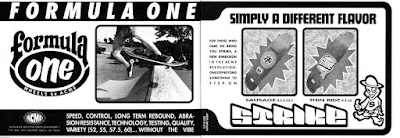
Yeah, you could say that. It definitely had more of my point-of-view than Acme.
I was trying to put out shapes that I thought were the future of skateboarding, which I think the first two Strike decks actually were. There was the “Street Worker”, which O always called “The Sausage” because of its round nose and tail. A pretty progressive shape for the time. And there was “The Funky Thin Ride”, which was the skinniest board you could make back then... because of the available truck widths on the market. You have to remember that this was 1991 and all boards were still 10 inches wide. Independent had the skinniest trucks, but they were still just 149s, so the Funky Thin Ride was nine inches wide. And it’s not like anyone was about to hand-cut their trucks like I was doing, either.
But yeah, I was pretty happy with how Strike was coming together… And then it got dropped. Jim lowered the guillotine after a few Acme riders mentioned that they wanted to ride for Strike instead.
Who?
Mike Santarossa, which freaked Jim out. All of a sudden, he’s like “Okay, no more Strike.”
 |
| photo: christian kline |
Is that why you left for Rocco?
There were probably ten factors involved in that decision. I don’t need to get into all of them, but it was a bunch of stuff. Egos, trust, company direction, etc. There definitely started to be a disconnect there. And by this point, Rocco was already at war with Jim Gray. I think he calculated that he could pull me from Acme in a “You Sank My Battleship” kinda way.
The interesting thing here is that my friend Christian Kline, who used to work at Poweredge, was actually working to rebuild Vision for Brad Dorfman. Christian pulled together everyone he knew to create two new companies there, which was Blue Skateboards and TV. It’s really one of the saddest stories in all of skateboarding industry history, because Brad Dorfman didn’t realize what he had, which ended up being Stereo and Toy Machine. He unknowingly wouldn’t allow for it to happen, so it all blew up in his face.
Ed and Mike did Television for a second after that, and then they approached me about becoming the graphic third to their formula. Because at the time, Mike and Ed wanted to take Television to Rocco, which was surprising.
“I thought you left Rocco, Mike?”
“Nah, it’s okay now.”
Well, okay. That’s kinda weird but stranger things have happened.
I thought about it and came to the decision that they were right. I had to move on with the future. Acme wasn’t turning out exactly how I thought it would and I can barely pay rent.
“What? Rocco’s gonna pay me $2,000 a month? Holy crap!”
So I did it. I got another divorce, this time from Jim Gray and Acme. And it was hard because I felt that company was kinda like my baby. I had all of these hopes and dreams, but it just wasn’t working out. So I quit Acme and got on board with Ed and Mike. And we were getting everything set up… when Mike goes into hiding.

Oh no.
Yeah, Ed and I are hanging out at Ed’s house all day, every day. But where’s Mike? What’s going on? So we end up going over to Mike’s house and Ann answers the door.
“Mike doesn’t want to talk.”
We basically had to barge into the house... because this is a pretty big move we’re making here, you know? We find Mike and he just starts yelling at us.
“I’M NOT MAKING ANOTHER DEAL WITH THE DEVIL! NOT AGAIN!”
Ed and I are just looking at each other, like “What the fuck are we going to do!?!”
So we go to Rocco and he says, “Sorry, Ed. You don’t have Mike and you don’t really have a team. There’s nothing really here for me, so you’re cut free.”
Ed starts freaking out, like, “What the fuck just happened!?!”
Meanwhile, Rocco starts asking me about what all I needed to come to World. Turns out that Steve felt bad for pulling me out of my own company with Jim Gray, so he was just gonna let me do art at World for now and we’d figure something out later. Maybe I could work with Tremaine on Big Brother or do some graphics with McKee and Cliver? It was just this unwritten contract we had going for a while. And that’s what I did. I drove up there once or twice a week and helped out with stuff… and jumped on the trampoline a lot. (laughs)

But wasn’t it awkward switching to Rocco? Because not only did he have beef with Jim Gray, he’d also gone after Blockhead, too.
Well, there’s that hard thing again: friends. My best friend at the time was O, and one of O’s best friends was Steve Rocco. O actually named “World Industries” after the David Bowie movie, “The Man Who Fell To Earth”. And he came up the original logo, too. O being in the mix played a big part in all of this for me. Because he definitely pushed me in that direction.
“Rocco won’t fuck you over, I swear! He’s my friend!”
O was actually more skeptical of Jim Gray than Rocco. I remember him always telling me, “Acme isn’t gonna work! Go ahead and try it, but it’s not going to work!”
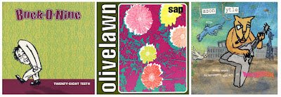
So I tried it. O even came on board for a little bit, too. He’d sleep in the Acme office all the time because he was couch touring. He started storing drum sets there. Olivelawn even started rehearsing there after a while, his band with Blender. And to me, it was funny. Because “The O Show” would drive Jim crazy. Everything would be so mellow and then O would show up to cause havoc.
“Hey Jim, we’re gonna have band practice here at six o’clock.”
“You’re what?!?”
But O would pull it off somehow. Jim would be arguing with him the whole time, but O would still make it work. And that was my comfort zone at Acme. I could get along with Jim because O was the counterbalance. Just this totally weird dysfunctional family thing.
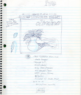 |
| Olivelawn 7" Design. Pencil: Ron, Ink: O |
Didn’t you design the first Olivelawn record?
Well, I worked on it with O. He came to me and I helped out with it, but the CD disc art was all me. I took the photo from some old book of a balalaika and did some Blockhead-style lettering, too. Stuff like that.
 |
| A few of Ron's record covers. |
How was working for Rocco?
It’s funny because Steve Rocco was one of my heroes back in the day. I actually had his second pro freestyle board with the checkers on it in ’82. He used to have all those photos in the magazines of him street skating around ’79 or ‘80. Doing handplants off curbs and benches and stuff. I loved that, because that’s where my head was back then, too. I truly thought that was the future of skateboarding.
But what you have to remember is that before Rocco started working for Vision as team manager, he was a used car salesman. The Rocco family sold used cars. And Steve actually had some of that stereotypical mentality. But because I idolized his street skating, he was always cool in my book. People would bag on Steve but he always got the pass from me because he skated street in the early ‘80s.
I was happy to work with Rocco, but he was weird. He was very cut-and-dry about most things, but he was also sort of a devious instigator, too. Like a devious little kid. But he was the first person in the industry to flat-out ask me what I needed to get paid, versus having to beg or silently hope for more money. The first thing he asked me was what I needed and when I came up with this low figure that probably wasn’t going to be enough, he goes, “You can get by on that?”
“I think so.”
“No, you need to make this much. A basic living wage. And I’m talking about your gross amount, after taxes have been taken out. Because it’s bullshit to tell someone that they’re gonna get $3,000 a month when they’re really only getting $2,000 after taxes. So I’m gonna give you this much.”
“Holy shit!”
Because at Acme, I was only making, like, $1100 a month. And that was before taxes. It’s funny looking back now, because for the time, that was about minimum wage. But I had a dream, dammit! (laughs)
 |
| Ron and Daewon Song |
But how was stepping into World after essentially laying the foundation at Blockhead and especially Acme?
To be honest, I never really understood my situation at World. Because they had another guy who would come in and do graphics... Dan?
Daniel Dunphy.
Yeah, he and I were basically freelance, but I was a little more in-house than he was because of the situation. But World wasn’t how I was used to working at all. Because for one, World Industries’ style was almost the complete opposite of mine. They specialized in these devious, satirical-type illustrations that looked like they came out of a comic book. All super intricate and sarcastic. And that was their thing, which I intentionally avoided for all of those years because I was doing other stuff. It wasn’t my style.
The way Rocco described the graphic process at World was that I needed to come up with ideas. Just print out a bunch of board shapes on a piece of paper and doodle some rough ideas or cut-and-paste some things onto it, then we’ll show the pros and they can choose whatever board they like.
…How weird! Because I was used to designing graphics for specific people.
“No, you don’t have to do that at all. Just come up with a bunch of ideas and if a pro likes one, we’ll clean it up and run with it.”
Well, that’s one way of doing it, but it never quite worked for me. It was just too confusing.
I did do something with Daewon that worked out pretty good. Daewon was wanting a meaningful graphic so I was able to go back to my old process, you know? It ended up being basically the evolution of man, with a big hand saying, “Stop! Go back!”
It’s probably the only board you could recognize as mine that World put out, but I’m proud of it. I like it because I’m branching outside of my style but people can still tell that it’s me. There’s a lot of fisheye stuff in there and some of the things I chose to include, like the UFOs. All tonal. It’s kind of an oddity but it was fun.
 |
| Rough sketches that became Tim Gavin and Jamie Thomas graphics |
How did you end up at Vision?
Well, Ed would come and visit me at World every once in a while. And one of the times he was there, he goes, “Hey, I know where I’m landing Television. Come to Costa Mesa. There’s gonna be a demo and I want you to meet somebody, but I can’t tell you who or you won’t come.”
So I go there and see the fold-up Vision mini ramp in the parking lot of Pat Tenore’s skateshop.
“What’s going on, Ed?”
“It’s Brad Dorfman.”
“Ed, I am not talking to Brad Dorfman.”
“Just talk to him! I’m probably gonna do my company with him. You might be able to do yours with him, too!”
Because during all of this, I’m still trying to get my own company off the ground. Rocco wasn’t interested because I didn’t really have a team or anything, just ideas. And Ed was wanting me to go to Vision so he’d have someone to work with. So I reluctantly talked to Brad and it actually became this thing were Rocco helped me negotiate my Vision deal. I would go back to Rocco after every meeting and he would navigate what was said so I could put Brad in his place. Rocco would tell me what to ask for and let me know whenever Brad was full of crap. It was pretty amazing.
I didn’t even want to do a company with Dorfman at first because of his track record. But after putting him in his place so often, calling out all of the things that Rocco said to, Brad really started to like me. All of a sudden, Brad really wanted me at Vision.

What kinda stuff would Rocco tell you?
Like “Ask him to pay you this, which is $100 more than what I’m paying you. He probably won’t go for that because he’s cheap, but maybe! Try and sell it like this.”
That’s what I did and Dorfman immediately agreed to it. Rocco couldn’t even believe it. But then it became real for me! Because I wasn’t expecting him to say yes, either. So now I’m not only heading up the art department at Vision, I’m also starting my own company with Brad and recreating his screen shop. And I’m also helping out Ed with Toy Machine!
It was a lot. And we tried to make it work. We really did. But Brad was so off on his own mission by that point that there was no saving it.
 |
| The Rarest Boards In Skateboarding History. |
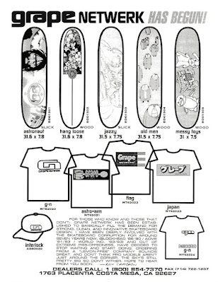
That was Grape Netwerk?
Yeah, that was ’93 going into “94... For about nine months or so. Just under a year.
What were you going for with that project?
Grape Netwerk was going to be my board brand. Just stuff that I was into at the time, like Weird ‘70s Kool-Aid packaging and KISS. Trying to bring all that weird ‘70s kid culture stuff into a company.
Because O and I always loved the word “grape”. Grape Ape. Grape soda. And we thought purple, as a color, was weird. Purple metallic Schwinn bikes. Purple muscle cars. Basically ‘70s thrift store culture that was super cool in the ‘90s. And I liked “Netwerk” because it sounded hi-tech. So “Grape Netwerk” was like a mash-up of low tech and high tech, like a computer network, but misspelled because it’s purple and weird.
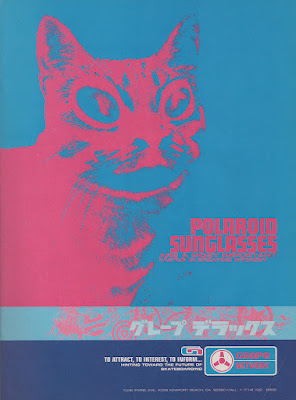 |
| No black. |
Well, the ads were incredible.
I actually put Ace Frehley in the first ad… just to be a dick. (laughs)
The second ad was a little more difficult because Brad was starting to get on me about budgets. Like, “If you can make an ad for this price, we’ll run it”, but it was always this impossible figure.
So I revisited my Sector 3 idea of doing a 2/3 page ad, because that would bring the price down to $2,000. And it’s basically an entire page but half the price. Unfortunately, my first draft was full color so it still cost too much money. I had to go back to Brad again.
“We can’t pay that much!”
“Well, I’m not going any smaller than a 2/3 page ad.”
“Knock it down to two colors! That’ll make it cheaper!”
The standard two-color ad is black and another color: either yellow, magenta or cyan. And a bunch of companies ran ads like this. It looks kinda cheesy, but then it hit me! What if we only use two of the colors and not black? The two darkest colors are magenta and cyan, and when we put those on top of each other, it creates a dark purple. We can use that as our black but it will be more explosive!
So, I went to Transworld and explained what I wanted to do.
“I don’t know if we can do that?”
“Yeah, just use these two color plates.”
“I guess you’re right.”
So we ended up running it and it caused such a riff at Transworld that they redid their entire media kit afterwards. Explicitly outlining that you can’t do what I just did. (laughs)
Did Grape Netwerk ever have a team?
Thomas Campbell tried to help me build a team but it just wasn’t working. He was trying to get Chad Muska and Drake Jones for me but they weren’t feeling it. That would’ve been amazing. Two cutting-edge skaters who knew about graffiti? I just don’t think they understood what I was trying to do.
I ended up going with a local Channel One and Acme amateur instead. Kyle Yanagimoto. Just a super underrated skater from Hawaii. I actually turned him pro and gave him a board. He was super good but nobody knew who he was.
I worked really hard on Grape Netwerk, but like I said, Dorfman was already on his own mission and it just didn’t work out. Once Ed decided to take Toy Machine to Tum Yeto, I knew it was probably time for me to leave as well.

Didn’t you help Ed with a lot of the early Toy Machine ads?
Well, the way that all worked out is that I didn’t like the pressure cooker-type environment of Vision, which was this shared little office with people disturbing me all the time. So I asked Brad to buy me a computer and let me use my spare bedroom as a design office instead.
Ed and I were best friends at this point. Basically, hanging out every day. And I remember him saying, “Hey, I need to do a Toy Machine ad but I don’t know how to do it. I don’t know how to work a computer.”
“Okay, come on over and I’ll help you. But here’s the thing: I”m not going to design the ad for you. You have to do it.”
“How do I do that?”
“I’ll sit with you and answer any questions so that you can learn how to do this on your own.”
So, it was basically Ed’s computer school. And I stuck to it. I never designed the ads, but I was there the whole time, giving him suggestions on how to accomplish whatever he was trying to do. But it was all Ed’s hands. If I had an idea of how to make something better, I’d throw it out there, but it was more about us just being friends and thinking on the same wavelength. We shared this weird societal zombie/control thing… that everyone was just a robot. Walking around, doing whatever they’re told. We were on that page. I remember us making these shortwave radio noises all the time, like, “Eeeeerrrrroooowaaa”. It was like our own little language. Just an inside joke.

What about that Toy series you did with the Barley Smoker and Ed’s Consume?
Well, the Smoker was originally just a one-off, but that went over so well that they decided to make it a series.
Those were from ‘50s health posters?
Well, the Smoker was. I used to buy these old Graphis Design Annuals back then from used bookstores and swap meets. And in one of those, I found this tiny little poster from Scandinavia or somewhere. It pretty much had that same side-view of the character with the lungs and smoke going in. I added a little bit to it, but it was basically a knockoff.
The thing is, you don’t really divulge that. You just show your graphic to someone and hopefully they think it’s rad. They’ll just assume you made it up, which I didn’t, but I also don’t have to tell them that. It’s the rip-off era and nobody cares anyway. But then they wanted to make it a series! Oh no! Because there’s only one poster in the book! Now I have to try and get inside this designer’s head from 1958 and create a whole series off this one image!
But I did it. I kinda figured out how to merge the concept with my style at the time, using similar elements so that it all matched. And I think I pulled it off… but there was definitely an “uh oh” moment.

I love those graphics.
Yeah, I really liked how Ed’s came out. Because he was so into Fugazi and veganism. Totally anti-corporate. I got to do all of this anti-American stuff with the flag and consumerism. I like that one the best.
Talk to me about your involvement with RVCA.
Well, I met Pat Tenore in ’93 through his old skateshop in Costa Mesa, which had a pretty unique spin for back then. It was more of a boutique shop that only carried select brands and he’d also have local bands play there, too. I just thought it was really cool and we always got along well.
He was into thrift store clothing, too. And with us both having such similar interests, we started conspiring to start a clothing company. The first action was Pat connecting with this Vietnamese family, the Nguyens. They ran what you might call a “no frills” sew house in the Westminster warehouse district. They did a lot of the cut-and-sew for BIllabong and could see the numbers coming through their shop, so they wanted to start a brand of their own. They just didn’t know how most of the semi-underground surf and skate fashion brands worked back then.
So together, we started RVCA out of Pat’s garage in 1995. We originally called it “Swinger”, like the old Kodak camera from the ‘60s, but it quickly became “Singer” due to copyright issues… and that didn’t work either. The Nguyens bought a computer for us and we started getting patterns made while I figured out all of the logos and psychology of the company. But as we got further into it, the Nguyens got really skeptical of us. Constantly wanting to know where their money was going and accusing us of not doing anything.
Unfortunately, after about three months or so, the Nguyens pulled our funding and sent some thugs over to confiscate the computer. That was phase one of RVCA. (laughs)

A couple years go by and I move to Palm Springs. Pat ends up finding me again, like, “Hey, let’s try the brand again. I’ve got a third person and a potential backer.”
The third person was Conan Hayes, a surfer from Hawaii. And they had a new name, too, because we already knew that Swinger/Singer wasn’t going to fly. They came up with “Ruca”, which was four letters so it could work on hooded zippered sweatshirts. Two letters and two letters on either side of the zipper, that kinda thing. I liked it because it was a weird word that felt familiar, but unusual enough to stick out. And it was something that people could pronounce… until what I did to the U. (laughs)
So yeah, they talked me into it and, all of a sudden, we had a start-up company going. But RVCA was easily the gnarliest one. I learned a lot, too. Pat gave me the title of graphic designer and brand ID. One of the three founding members… which I fucking hated titles... but I came up with all the logos, the ad campaigns, the t-shirt graphics and the color palette. Everything you see. Pat did all the textiles and cut-and-sew as well as the business end. And Conan retired from surfing to lead international sales and marketing. And it was just the three of us for the first year or so. But even after we started hiring more people, it was still twelve-hour days, seven-days-a-week... for years. It was crazy.
Our big break was when we finally printed some t-shirts with my weird logo and design placement on it and got a connection to Fred Segal in Hollywood. Suddenly, Brad Pitt is on the cover of the Enquirer wearing a RVCA shirt. That’s when we knew that we were gonna make it.

Gotta ask, why did you make the U a V?
I wanted that U and the A to look like up-and-down arrows, like weird caveman graffiti or alien lettering from a UFO. But people weren’t feeling it at first. I remember all of the old skaters around Orange County totally mocking it, like, “What the fuck is this? RVs of California?”
Even Pat said, “Oh no! You did the logo wrong!”
No, I didn’t. The logo is working because people are talking about it. To survive, we’ve gotta be a love-or-hate thing. We’re never gonna make it if we’re just floating in the middle. We’ll be another one of those thousands of clothing brands that come and go. This is making people talk.
And to this day, I still see people wearing that logo shirt. My god, I designed that in 1998. So wild. But because of things like that, I think RVCA is probably the most timeless thing I’ve ever created. People are still wearing it, which is crazy to think about.
That’s amazing, man.
Yeah, I’ve somehow been able to reinvent myself three times now.
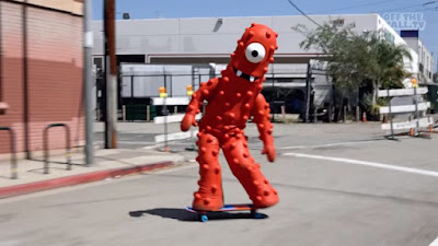 |
| Fun Fact: Ron skated as the stunt double for Yo Gabba Gabba's Muno. |
Well, it’s been amazing to watch you revisit your early work with these recent Blockhead reissues, but would you ever try your own board brand again?
That’s actually what I’ve been getting ready to do for these last few years. Learning from industry people on how to do a company by myself, correctly, with an understanding of real-world company structure. That’s what my Nothing Is Cool experiment was about in 2017; trying to go through that process... but there were a bunch of misfires. I didn’t always take people’s advice and I wasted a lot of money.
I’ve been regrouping for the last few years and now I’m back at the starting gate. Let’s hope it works out this time. I was just so far on the creative side before. I avoided the business side for so long until finally realizing that was my problem. I always tried pairing up with someone else to handle the business side of things, which meant that I’d automatically and willingly be oblivious to all that. Anyways, I've learned some hard lessons but I’m ready to get on with successful businesses now... without getting in the way of myself like I unknowingly used to do so often.
 |
| Toy Machine vs Strike Series, 2008 |
So what all can we expect to see from you next? Because I know you’ve been DJing a lot, too.
Well, I have three things that I’m working on.
First off, not a lot of people know what “The Way Out” stuff that I’m doing actually is. People hear DJ and they either think of hip-hop party bangers, that I scratch or that it’s dance music. It’s none of that. I actually approach it more like a ‘60s radio disc jockey. I’ve done it live and on a local college radio station, but I’m actually pitching it to larger stations in Los Angeles. So there's that, which will probably have a clothing line that comes out of it, too.
I’m also working on a brand called “Ron Cameron Designs”. That will be clothing, too, but also affordable art prints and paintings showcasing my work as a designer.
And third, I’m gonna relaunch "Nothing Is Cool". Just going with my vibe from ’89 and letting people finally have all that on shirts, jackets and hats. All the good stuff, along with reissues and some new things, too.
Those are my big projects right now. I’m currently getting all of the websites ready as we speak. Hopefully, I can launch everything soon. There’s actually gonna be a lot of “limited edition” stuff on there… I hate that term… but some rare and affordable pieces that will hopefully get us out of the starting gate and fund some other projects I have in mind.
...That and I’m working on my coffee table-style graphic design and skateboard art book again, also called “Nothing Is Cool”, because it just has to get done. I’ve been working on this thing, off-and-on, for ten years now. So to all the collectors out there, please contact me if you have any of my old boards that aren’t all scratched up. I’ll probably need some of you to photograph the boards... with my careful instructions, of course. Especially collectors outside of the USA.
 |
| photo: Brittain |
I can't wait to see all this come to fruition, Ron. I know it's been a long time coming. And thank you for taking the time to chat with me today about everything. I don't think enough people fully realize the crazy impact you've had on skating over the years.
It just comes down to turning people on, man. Making rad shit and stoking people out. That’s all I’ve ever tried to do. I’ve had a lot of heavy life shit go down over the past few years but I survived and I’m ready to start making rad shit again. And it's just me this time. No partners… for better or worse. I just can’t put this off any longer.
Big Thanks to Ron and Bryan Ridgeway.
We Dedicate This Interview to "O".
=O =O =O
Follow Ron's Projects:
[RON CAMERON DESIGNS]:
WEBSITE: www.roncamerondesigns.com (COMING SOON)
INSTAGRAM: @roncamerondesigns
FACEBOOK: https://www.facebook.com/profile.php?id=100063551777995
[NOTHING IS COOL]:
WEBSITE: www.nothingiscool1988.com (COMING SOON)
INSTAGRAM: @nothing_is_cool_1988
FACEBOOK: https://www.facebook.com/nothingiscoolOFFICIAL
[THE WAY OUT]:
WEBSITE: www.thewayoutoutout.com (COMING SOON)
INSTAGRAM: @lll_the_way_out_lll
RADIO / DJ SHOWS: www.mixcloud.com/roncameron


6 comments:
I remember the Ron Cameron Brainfloss and at the time — it seemed so spot on zeitgeist for embodying a model of skate adjacent artist practitioner (operating in the wake of the beastie boys) . . . was really hip stuff back then - really conjured some lost memories!
So good. Thank you both.
Amazing read! So cool to read all the backstories on all these awesome graphics from over the years. Ron rules.
This was a great interview. I know most of the general lore about Blockhead and it was cool to hear some more stories, even if things didn't always work out.
Amazing interview!!!! What happened with RVCA? Wiki and its site erased him :(
For those who haven't yet, picking up "Art, Skateboarding and Life" would be a great way to dive deeper into Howell's world and get a sense of his wide-ranging impact. Thanks for sharing your thoughts and the recommendation! If you're ever in need of a detailed analysis or summary of any case, don't hesitate to ask me to write my case brief .
Post a Comment