
Thumbs up.

Having grown up with your often-controversial graphics over the years, I’ve always been struck by how mild-mannered and quiet you come across in interviews. Is art just how you express yourself?
Yeah, I like to think that if you’re at all socially awkward, you’re ideally suited to become an artist. And I definitely fit that bill.
So, how did all this come about? Because I know you started drawing at an early age, was art just an extension of cartoons as a kid? Comics, perhaps?
Definitely cartoons in the beginning. Coming home from first grade, I remember my parents planting me in front of the tv for hours, basically from three o’clock until dinner. Lots of Underdog and Popeye cartoons. Looney Tunes.
Then, as I got older, I started listening to a lot of metal music and album covers quickly became a huge influence on me.

I know Slayer had a big influence on your Satan graphic, but what else?
Iron Maiden was definitely my go-to in middle school. They were my all-time favorite.
I miss the days when metal bands had mascots. Iron Maiden was Eddie, right? …Or was that Vic?
Yeah, Eddie was Iron Maiden, which was done by Derek Riggs. Vic was Megadeth, by Ed Repka. Actually, both of those had a big influence on me back then, with the recurring characters on covers.
I miss that about metal. All the covers are photographs now.
But it’s not difficult to connect these dots with your later work at World. Did you always draw in that cartoony-y kinda style?
Pretty much, yeah. If anything, I’ve gotten even more cartoonish over the years. But that also has a lot to do with how World looked back then. The very first graphic I ever did was the barnyard for Mike Vallely, which is already a pretty cartoonish place to start.
This was also around the time when “low brow” art was taking off with Robert Williams and Juxtapoz Magazine. There were a lot of edgier drawings floating around with hot chicks and stuff like that. Just an overall “outsider” type of vibe, in general. I feel like that informed a lot of my graphics back then, too.

You grew up in the Bay Area, right? Riding bikes?
Yeah, I’m from Marin. I did skate a little back in the day but I always had a hard time with it. I actually ended up getting totally obsessed with BMX freestyle for the longest time. I had a ramp in my backyard and everything. I was even sponsored by Vision Street Wear for a while. (laughs)
Oh wow, I didn’t know that.
Yeah, this was at the height of Vision in the late ‘80s. They sponsored, like, a million BMX riders at the time and I was able to get on the team somehow. Free boxes of clothes… lots of fanny packs.
I even did a few demos for Vision Street Wear at Magic Mountain. It was this weird mixture of bike riders, freestylers, Ron Allen and Jesse Martinez. There’s no way Jesse remembers me from back then, but he definitely skated in a few of those.
You moved down to LA for art school?
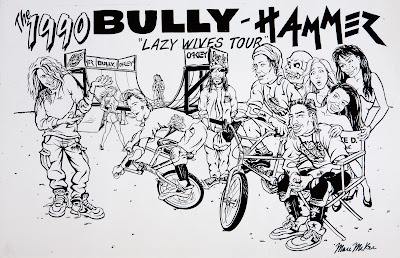
Yeah, UCLA was very economical for California residents in the ‘80s. The tuition was very low, so luckily, I didn’t really have to work while going to college. I did do some side-gigs, but those were all things that interested me. Like, growing up riding bikes, I got to work with Bully Bikes when I was a junior in college. That was kind of my start in doing art for a living, beyond just a hobby.

I find Bully Bikes fascinating, because I know a lot of key World figures came out of there.
Yeah, because it was all down in that Hermosa/Redondo Beach area.
But you’re right, it’s crazy how these separate worlds of BMX and skateboarding came together back then. Because Spike Jonze got his start at Freestylin’, which was a big BMX magazine at the time. Andy Jenkins was their art director, too, which I believe was his start as well. They went on to do Club Homeboy, which was this crazy blend of BMX, skateboarding and music. As it goes, the publisher of that magazine was Bob Osborn, his son RL Osborn is this BMX legend who also started Bully Bikes. And that’s where I was.
It just so happened that Rocco was renting a room from RL at the time, right when he was starting out with World. At one point, it was actually RL, Andy Jenkins, Rodney Mullen and Steve Rocco all living together at this house in Hermosa Beach. That’s basically how we all got introduced to Rocco.
As World got a little bigger, Rocco got his own warehouse going in Redondo Beach… in the same office park as RL. World Industries moved in right next door to Bully Bikes, so it was only a matter of time before I crossed over and started doing stuff for Steve, too.
But if you’re this sponsored BMX guy, why take a job at a skateboard company?
BMX was winding down for me at that point. Because I always rode ramps, the level of difficulty advanced so quickly in the mid-80s. All of a sudden, I could only relate to the flatground tricks… and I couldn’t even keep up with those after a while, either.
Suddenly, I found myself taking my artwork much more seriously. (laughs)
I was still going to UCLA when I got the job doing Bully stuff, but there really wasn’t much work for me to do there. Maybe a couple t-shirts and some stickers? And I found that my pay was always in question there. Like, I did one illustrated ad for Bully, a double-page illustration, and I remember RL being taken aback by how much I invoiced him for... but it took a really long time to draw that ad, man! And I was only trying to get maybe three or four hundred bucks for it anyway. He did pay me, but he clearly wasn’t happy about it. I didn’t do too much work for him after that.
How did Rocco hit you up?
I know that RL had shown him some of my work. I just remember Rocco wanted me to work for him as much as possible, which was great. The problem was that I still had two more years of college left. So I had to start setting up all my classes for Tuesday and Thursday, driving down to World on all the other days. Working out of my apartment a lot, too.
What year was this?
This was 1989, right after it had switched from being “Rocco Division” to “SMA World Industries”. I never worked in the Spencer Street building, which was the very beginning. About a year into it is when they moved to Del Amo in Torrance, that’s when I started.

How many people were working there at the time?
(laughs) Like… four. We always used to trip out on that, actually.
There was me, Rocco, and one other guy working there at the time, Walter Sims. He was in charge of IT but he also did a lot of marketing, too. He did a lot of the black-and-white ads with Rocco early on. I’m pretty sure he got his start there as a consultant… Because the first time I met him there, I remember thinking to myself, “Who’s this dude in the suit?”
He was a skater, just a little older than me, but the fucking suit threw me off. He must’ve still been working for whatever agency he was with, but after a while, he worked at World full-time.
…But the rest of the staff was all women. That was Steve’s modus operandi back then: to only hire women. Even to work in the warehouse and drive the stakebed truck. Anita Tessensohn used to work in the warehouse, actually.
Oh wow, I remember her from Public Domain. She was good!
Yeah, she skated for Powell but actually worked at World. Steve hired her for the warehouse, which I can’t imagine George Powell was too crazy about. (laughs)
Was Megan there yet?
Yeah, Megan was there when I started. Going back to that Bully crossover we were talking about, Megan’s sister Molly actually worked as an assistant at Bully back then, too.

What were your first impressions of World Industries?
It was exciting. Because even though I didn’t really skate anymore, I knew this was some top-tier shit. I knew a little about Rocco at the time but everybody knew Rodney Mullen. Having him involved was huge. I knew about Natas and Santa Monica Airlines as well, but I didn’t really know about SMA Rocco Division so much. I was aware that Steve had this company going, just by going down to RL’s office. But I didn’t know much beyond that.
How did Steve sell you on the job?
We didn’t even discuss pay. We just talked about this Mike Vallely board, which was the first graphic he needed me to do. The Barnyard. Steve told me about Mike’s idea and how he wanted me to reshape it. How to make it a little less serious and more fun. Because Mike wanted this straight vegetarian statement, meanwhile Rocco’s telling me about how he wants a slaughterhouse in the background and everything... that’s how all that stuff got back there.
I go back home to start working on it. And even in the beginning, I’ve never been one to do preliminary sketches to show people. I just did it.
Two weeks later, I head down to World to show them what I came up with. I just remember Rodney laughing uncontrollably when he first saw the graphic... and I didn’t know Rodney very well back then. I thought he was going to have a seizure or something.
It was inspired by the George Orwell novel, Animal Farm. That’s the storyline I went with, where the anonymous farmer gets killed by the animals.
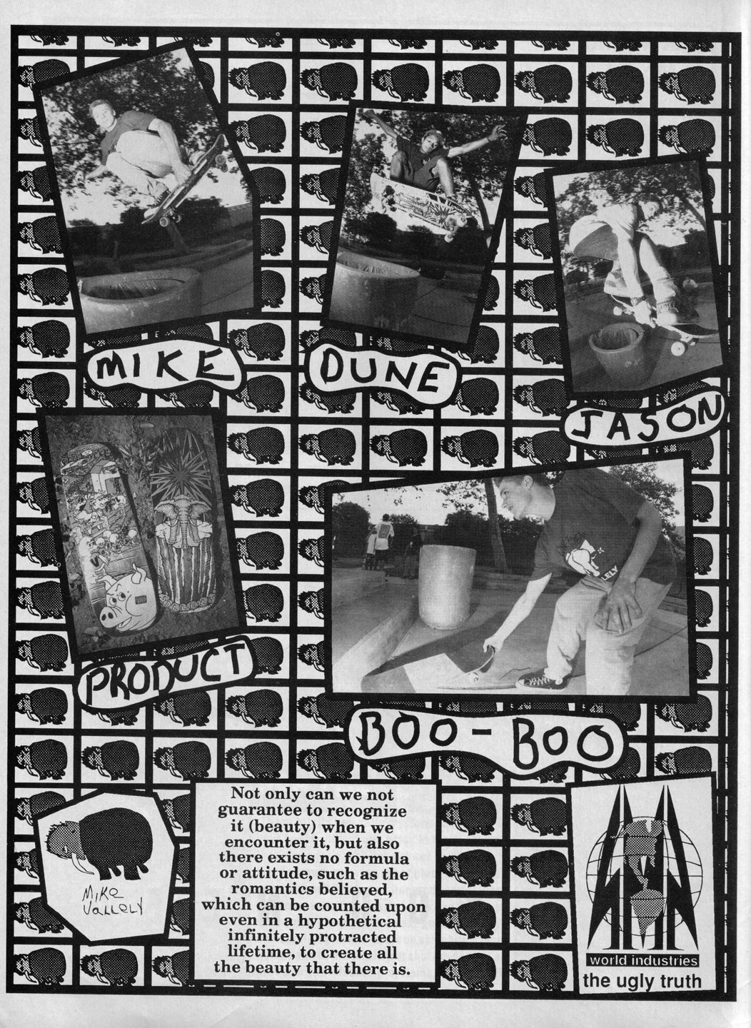
There’s so many little details going on in that thing, even down to the ducks.
A lot of the little details came from Steve. But going back to those early cartoon influences, DuckTales was always one of my favorite after-school shows growing up. And it’s on a farm, so ducks make sense in that setting. I was also listening to a lot of rap music at that time, too… let’s give one of these ducks a gold chain and a radio. Okay, that works.
Was Mike pissed when he saw it?
He was living in Edison, New Jersey back then, so he really wasn’t around. But from what I heard, he didn’t like it too much at the time. But a few years ago, we did do a 30-year anniversary version of the barnyard together, so he must be okay with it now. It did sell extremely well.
I only ask because of Cliver’s notorious run-in with Sheffey over some graphics. Anything like that ever happen to you?
No, I’ve never really been confronted by anyone. Definitely not like that. Because I give off a pretty weird vibe, maybe I’m just unapproachable or something? (laughs)
Mike definitely didn’t like my follow-up graphic to the barnyard, which was for his mini model. And looking back, it’s admittedly not very good. I know a lot of people like it, maybe because it was their first board or something? But a baby elephant in clown makeup with a broken skateboard? Not exactly the type of image Mike would want to portray himself with.

What all were you working on at this point? Were you working closely with Rocco back then?
Yeah, I was. I did almost all of the graphics at the time. I didn’t really work on the ads. Maybe one or two… like that one of Rodney’s tour escapades in Europe. I did all the drawings for that, but it was primarily Steve and Walter doing the ads together back then.
One early project was the Stick-O-Rama board, which was a blank street scene deck that came with stickers of a bunch of different characters. That was fun.

I always thought that board was genius.
Yeah, it was initially Steve’s idea but I came up with the street scene and all the characters. Because there’s a guy in there who kinda looks like Eazy-E, but Kool Moe Dee is actually depicted there, too. That really was supposed to be Kool Moe Dee. The whole concept was loosely based off this old 70s toy called “Colorforms”. Even the top graphic is kind of a rip-off of the Colorforms logo.
I feel like a lot of Steve’s early success came from having so many things based off of children’s toys. Because, like I said, the Stick-O-Rama was based on Colorforms. And you had that Jason Lee mini graphic, which was a Tonka truck. He had the Rock’em Sock’em Robots for Jesse Martinez, too. That was a recurring theme in Jesse’s graphics because he was known for fighting.
I love the one with the robot in the jail. Is that modeled after the Thinker?
Yes, it was. Since Jesse was probably in jail at that time, I figured that he must have a lot of time on his hands to be thinking things over.
One of the most distinctive things about that graphic for me is that the perspective is meant to be seen diagonally. It’s not really a landscape or portrait orientation. I just wanted to try something different there, because I’d never really seen that before.

Coming from BMX, what skate artist influenced your early work the most?
I would say Pushead in the very beginning. Obviously, Jim Phillips and VCJ, too, but I really liked Pushead’s stuff. Because even though I didn’t really skate, I’d still check out Thrasher all the time and Pushead always had great drawings in there with the music reviews. That was a big influence.
I’m a little surprised by that.
Yeah, I guess it didn’t really show up in my work so much. But in the process of learning how to draw in high school, I would copy his drawings a lot. That’s basically how I learned to draw in ink.

Were you aware of Steve’s loan shark situation back in the day?
No, I wasn’t. Apparently, I wasn’t aware of a lot of backend stuff back then, going all the way through the mid-90s. Because in 1994, World sold off 25% of its ownership to a Japanese distributor? I had no idea, and I’d been working there for a while at that point.
But I used to see John Kirby all the time. He’d always come by the office to check up on things, but I never saw any type of threatening situation. I don’t know how it was prior to my starting there. World was never on the verge of bankruptcy when I worked there, but I’m sure things were much different when it was just starting out.
What was Rocco’s outlook when it came to graphics?
Well, he definitely had his opinions. And he would art direct the graphics early on, but I largely had free rein to do whatever I wanted. He always wanted me to just go for it, but he also had to like the end product, too. Because if he didn’t like something, it wouldn’t get used.

What type of things would he typically shoot down?
Recently, an old Ron Chatman graphic came to light that Steve shut down. It was Ron’s idea… kind of a random one, because Ron and Jeremy Klein had all their own lingo at the time. “Jacked”. “Jacking Tools”. “Cut”. Everything was “cut”, which meant it sucked. Ron wanted me to draw a gremlin climbing on a vine with a bucket full of jacking tools, but Steve didn’t want to use it, so it fell by the wayside.
There was another board I remember for Jason Lee that Steve rejected, which actually led to the Satan graphic. Jason wanted a Dracula graphic, so Mark Gonzales asked his cousin Ernie Mendoza to do it. He was an artist who used to do some stuff for Blind back then. A total OG. I think he’d been in and out of jail a few times, so he had that classic ballpoint pen illustration style which he fine tuned while incarcerated. He also did all of the title work for Blind Video Days.
Jason was super into Bauhaus at the time. They have a song called “Bela Lugosi’s Dead”, which is why Jason wanted a Dracula graphic. I feel like Jason was envisioning something a little more goth, but Ernie’s graphic looked more like Bela Lugosi, the movie star, instead of Dracula. It really wasn’t scary at all. It felt more “kitsch” than horror.
So yeah, Ernie drew this Dracula graphic and Steve didn’t like it, so he asked me to take a pass at it, which ended up morphing into the Satan board.

How did Rodney fit into all this?
Rodney was never too involved with graphics. His main creative outlet back then, besides skating, was designing shapes. He was super into that, because every new board that came out back then had a different shape. He’d always have these cardboard cut-outs with him, an illustration board or a mat board. Sometimes it was only half of the board and he’d flip that over to make it symmetrical. But I remember him always having these cardboard cut-outs laid down on the carpet of his office. Sometimes, he’d ask me to stare at the cut-outs while he described each shape to me.
(laughs) What kinda stuff would he say?
(laughs) I don’t know. Because some of the noses were a little more pointy… I guess he just wanted me to appreciate the curvature of the wood.
There’s even a catalog from the early days where he gave all text descriptions of every shape we offered. Not even photographs, just text. He was sincere about that.

Would he have to approve graphics, too?
No, just Steve. And Steve rarely shot stuff down. You can tell because he let all those Jef Hartsel graphics through. All that Rasta stuff? Those were definitely not Steve’s cup of tea. (laughs)
I always thought they looked cool but had no idea what they meant. Granted, I was 11…
What? You didn’t know about Rastafarianism back then? (laughs)
(laughs) But you did the tree one, right? I always loved that one.
Yeah, that was Jef’s idea. I got lucky because it was basically just a bonsai tree. Doug Smith did all the other ones, which were much more involved.

How would graphic ideas typically originate?
In the beginning, most of the graphics I did were just whatever ideas I could come up with. Every now and then, someone would throw out an idea for me to work on, but that’s not how it typically went.
I will say there was quite a significant change when Natas came on. Because, besides Powell, I feel like 101 had some of the best art direction ever. Natas led all of that. I remember him coming to me with the idea for the Space Shuttle Challenger board… nobody else would’ve been coming to me with a Pop Art reference or Roy Lichtenstein back then.
When I first came to World, I didn’t even know who Keith Haring was. I remember Rocco being pretty astounded by that. But Natas was hip to all that stuff. He turned me on to guys like Robert Williams and all the underground comic stuff. Peter Bagge and Dan Clowes. He just had a better awareness of the larger art world.
How was working with Mark and Blind, in comparison?
I didn’t really work hand-in-hand with Mark on anything. He kinda did his own thing, for the most part. He didn’t art direct any of the stuff I did for Blind. Not at all.

But how was it emulating influences like VCJ? Or even guys like Norman Rockwell and Roy Lichtenstein?
I enjoyed it. I feel like that’s a good way to learn how to draw. It’s okay to copy other people’s styles at first because the odds are if you’re trying to come up with your own style from the get-go, it’s not gonna be it. You have to try out a few different things first and work it out.
How long did graphics typically take back then?
It’s different now, because of all the computers and heat-transfers. Things are way easier. But back then, I’d say a graphic typically took around two or three weeks from start to finish. Doing color separations for the silkscreen process were always pretty complicated, so that tended to take the most time. Cutting out rubyliths for each color. That took a while.

What graphic took the longest?
The Colvinetics graphic took a long time because it was airbrushed. The volcano from the Dianetics cover? That was originally supposed to be for Jason Lee.
Was this pre-Scientology?
No, I’m pretty sure he was already in the Church at that time. That’s probably where I got the idea from, I had heard he was into Scientology. He didn’t want to use the graphic, so it ended up with Randy.
Were pros very picky about graphics back then?
(laughs) No, not at all.

But it did seem like Randy and Jordan Richter got more than their fair share of wilder graphics.
Well, I was aware that Jordan probably wasn’t going to like the cartoon of himself masturbating as a graphic. That’s why they didn’t re-release his board when Dwindle reissued that series a few years ago, which I thought was kinda lame. I mean, I understand him not wanting that graphic re-released but then maybe not reissue the series if you’re not going to do all of them?
But yeah, I knew he probably wasn’t going to like that one, even as I was drawing it. He always got shit for being the “token vert skater” on Blind. People fast-forwarding through his section in the Blind video. Crap like that. And he was aware of all that stuff, too. But those boards did sell. At least he got a paycheck and some royalties.
You said that Randy would inherit a lot of these because he was in Arizona?
You know, I’ve seen him in the last year or two at PrimeWood, because they’re reissuing a few of his boards. We talked about that a little and he goes, “Hey man, I just wanted to skate. I didn’t give a fuck what my graphics were.”
What’s funny is that the only graphic I ever remember him specifically asking for was his Goodwill Graphics. That’s the only one.

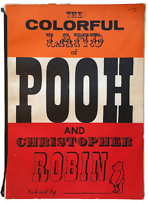
Why Pooh for Rocco?
That, I don’t know. I didn’t do his first Pooh board, but I remember when I first started working there, one of the major references in the art department was this Winnie the Pooh picture book. I still have it to this day. It was basically Steve’s resource book for his first few boards. He just copied stuff out of there.
I came in with the Rocco 3, which was Steve’s idea. Because for the Rocco 2, he had the honey jar on his head. For his next board, Steve wanted the jar to be off his head and smashed on the ground, to where you can see that Pooh has emerged as the devil.
Why do you think the devil fascinated Steve so much?
I feel like the Rocco 3 really set that in motion. Because there was the pitchfork logo, too. O actually did that one, right when I first started working there.
That was just Steve being provocative. He was never into the occult or anything. It was just an easy way to piss people off, so let’s do it. Because back in the '80s, there was this whole thing going on with Satanism. Congress was afraid of Satanic messages in music, it was definitely a thing in pop culture.

The Satanic Panic.
Exactly. Steve really seemed to enjoy that and wanted to lean into it.
How much does a skater’s personality inform a graphic? And does that always make it better?
Well, it kinda depends on their personality. Some guys are just “skaters” and that’s all there is. There’s not much you can do with that. It doesn’t really translate into anything specific. But yeah, if there’s ever anything more to work with, that’s always a plus.

I always loved Jeremy Klein’s Candy Bar graphic, where it’s attacking the vegetables.
That’s a great example, because Jeremy lived off candy. It was a fun way to play with that aspect of his personality, which rang true. I always liked the top graphic of that one, too. With the vegetables lined up for the firing squad, smoking cigarettes? That was a fun one.
But wouldn’t you and Cliver have nameless graphics floating around as well?
Yeah, but most of those were already intended for another rider. Sometimes they would jump ship, so then I’d just give it to another rider. Like the Accidental Gun Death graphic was originally intended for Jason Lee but he ended up leaving for Blue. Guy essentially got that one because I didn’t have anybody else to give it to. It had nothing to do with Guy’s personality.

Was Jason’s American Icons based on anything?
Megan had a book on Andy Warhol, one of the miscellaneous books we had in the art department. I’ve since looked for these pieces online and never been able to find them, but Warhol did all these black-and-white silkscreened images over a colored background. Not a stained glass-looking background but a mosaic of different colors… because that’s what the original Icons design had, before the flag. It had all the icons with this multi-colored background. We actually did a really small print run of that.
There was an American flag in the original design but it was just on the tail. Really small. After that initial run, I remember Jason asking, “Hey, don’t you think it would be better with the flag as the background? Really big?”
So, I changed it up after that, which was a good call on his part. But I don’t know where the original idea came from. Just a random idea I had. My own little statement at the time, I guess.
Why the two different lines for the shirts?
“The Official Dope” was Walter’s call. Because that design was beer and cigarettes, the legally condoned drugs back then.
“USA #1” was my idea. And I’ve heard a story that when Blind went to the UK back then, Gonz got a lot of flak while going through British Customs because he was wearing that shirt. I really wish there was footage of that. (laughs)

Talk about the value of gimmicks, especially when enabled by Rocco’s money.
All of the gimmicks definitely came from Steve. Like Sean’s board he did for Ronnie Bertino? Mr. Butts from the Doonesbury strip? Steve just had to package that with a cigarette. Even Big Brother, it was Steve’s insistence to make every issue a different size, which was incredibly expensive. That and the trading cards and the cereal box… he loved that kinda stuff.
For me, it was always a little more complicated. Because, of course, the main selling points are always the skater and the shape, but I always wanted the graphic to be a key selling point, too. I never wanted a free knickknack to be the reason you bought a board. That’s just me speaking as an artist, as opposed to a toymaker.
Granted, each board is different, but what are you ultimately trying to accomplish with your graphics?
Sarcasm. I want the art to be good, too… but honestly, I’m just trying to be funny. Funny in a wiseass kinda way.

I can’t help but think of that Big Brother article where you and Natas go to Disneyland in search of graphic inspiration. Was that a real thing?
Yeah, we would go on little excursions out of the office. Because this was before the internet, you couldn’t just do a Google search and have a million photos come up to choose from for reference. I remember going to the library a lot back then to check out random books, just because of whatever pictures I found inside. It was definitely more of a hunt back then.
We did find Rodney’s “Rock is King” graphic that day. That actually wasn’t at Disneyland, we went to Hollywood Boulevard later on. Funny thing, someone recently contacted me through Instagram about that graphic. I guess he used to skate back in the day and his Dad is the original artist of that Rock poster from the ‘70s. The whole thing was pretty random, but apparently, he was cool with us using it.
For the Koston Buddha graphic, I remember us all heading over to Chinatown. We already had the idea, so we just went inside all of these knickknack stores and took photos of the Buddha statues.

Randy’s Censorship graphic came from the pages of Penthouse. And I have to imagine his Velvet board also being some found inspiration.
The Velvet board just another random idea I had. It came on the heels of that ‘70s Blaxploitation film movement, which was still very much a part of hip-hop at the time. There was a lot of retro interest in the ‘70s going on back then. For that one, I remember going to this gift shop in Hermosa Beach that had a lot of blacklight posters, just to check ‘em out. I didn’t actually buy anything there, because that graphic is based off a Frazetta painting. It’s not a black woman in his painting, but it’s the same figure and I randomly got the tiger from somewhere else. Luckily, the guys where we got our boards screened at knew how to apply that black velvet stuff and made it happen.
Randy’s Censorship graphic was just me wanting to put a naked woman on a board. The whole censorship angle was me putting a spin on it, making it seem like there was more of a message behind it. We couched it in a certain way to make it seem like we were fighting censorship, but it was really just a handy excuse for pornography.
That woman just happened to be in Penthouse that month when I went by the newsstand. The pearl necklace was a nice touch, too, but a total coincidence. I still have the issue. I think her name is Linda Johansen. I found out later that after modeling, she became an entrepreneur in the adult entertainment industry in Sweden. I felt kinda vindicated by that, knowing that she’d made a full career out of this. She wasn’t just exploited as a centerfold for a month.

I read somewhere that you don’t like how you drew her.
Yeah… specifically, the genitalia. I hadn’t done sufficient enough research at that point. I didn’t have an adequate intimate knowledge of how that should really look back then. (laughs)
The Erik Ellington one they did for Deathwish was much better.

You did the J Lee Burger King logo for his Burger board, and I know there’s an unreleased spoof of Mike’s “Animal Man” graphic that was also supposed to be for Jason…
Yeah, basically a carnivore version of the Animal Man graphic, “Barbecue Man”. The superhero Animal Man comic but it’s a barbecue guy with a bunch of barbecue dishes I copied out of a cookbook. That was me trolling again. Because even the Burger board, I originally made that for Mike Vallely as an ironic statement, which he wanted no part of. So I gave it to Jason.
Jason claims that none of these were intended to be Mike V disses.
Yeah, I’ll take his word on that. But for my end, the Burger graphic was definitely a diss. I didn’t really have any part in the ad, though, he just went out and shot it one day. I didn’t know anything about that.
…In hindsight, I shouldn't have made the silhouette of the barbecue chef so skinny. If I ever redo that graphic, I’m definitely gonna make him a lot fatter.

As Steve’s mouthpiece, how was it being an active participant in his beefs? Like, did you hate Powell, too?
No, I didn’t hate Powell, I just enjoyed the mischievous nature of it all. Being a troublemaker. It’s not that I wanted to see them lose their team or anything like that.
Do you happen to remember the OG “Nice Ad” ad that Thrasher wouldn’t run?
I never knew what they were referencing there. Because it said they were making fun of Powell in the ad but I don’t remember what the original ad was going to be. That was all Steve.

Was there actually an original ad?
There must’ve been. For him to come up with a replacement like that, he must’ve submitted something else. He wouldn’t have just made all that up.
It feels like the ads were a completely different stream from boards, at least early on.
Yeah, I usually didn’t even see the ads until they already were out. But to that point, I love how editorial they always were. They weren’t really pushing product as much as they were simply making statements.

Did Rocco come up with the Powell Rip-Offs?
The Powell Skull series was something I thought of, because I knew Steve wanted to get back at Powell after their “Me, Me, Me” ad. But Steve’s the one who actually made me change the first version of Rudy Johnson’s graphic. Because in the original, it had still had the Viking helmet from Per Welinder’s graphic, but the skull had braces on. These elaborate armature braces, super exaggerated with headgear and everything. Steve felt that it still looked too much like the original. He wanted to avoid a cease-and-desist from Powell so he could keep making these boards for however long he wanted to. That’s when I came up with the football helmet.

I know the dodo graphic was originally supposed to be Danny’s…
That was actually one instance where Rodney brought something to my attention. He saw my original drawing and immediately said, “You can’t do this to Danny.”
He filled me in on the whole situation at Fallbrook and the rivalry between Danny and Tony back then. It was definitely Rodney’s call not to do that. I just didn’t know… And I didn’t even think of the “big nose” aspect of it, either. I was just trying to think of the most ridiculous bird to use: the dodo bird.
But were those boards in the works for a while? Because Danny had been off Blind for a while by then.
Not that I recall. I don’t really remember the timeline, but the Powell-Rocco beef was an ongoing thing. Yeah, the Spoof series came out in ’91, but it actually began in ’89 with Steve getting Mike V and Rodney on the team.

How did Rocco get the Blind team to go along with such a dramatic statement? Because looking back, it doesn’t really seem like their style.
Yeah, and since then, I believe they’ve gone on record saying that they weren’t really down with making fun of Powell… who knows? Everybody was so young. I don’t think anyone was really thinking things through back then.
Powell did make those “Little Boys Who Play With Themselves Go Blind” shirts, right when Guy and Rudy came on as amateurs. That might’ve played a part in it.
Was that the first modern board series?
I gotta give that up to Roskopp and his target series.
Yeah, but that was one guy over the span of several years…
That’s a good point, because that Blind series did all come out at the same time. Maybe? I never really thought about it like that. We were just wanting to make a statement.

What about all those Warner Bros “Thumbs Up” boards?
That was because one of my reference books at the time was this Looney Tunes’ History of Animation book I had. I would copy a lot of Tex Avery and Chuck Jones characters out of there and adapt them to graphics.
This is back when Sean and I had a separate art department office to ourselves. Every once in a while, the team could stop by and just barge into our office. Tagging the walls and rifling through our stuff. That Looney Tunes’ book would typically be lying around, and for whatever reason, the guys would always pick it up.
“Holy shit! I want this for a graphic!”
So, I obliged and made all those boards. Not that I wanted them to look lame, but I intentionally wanted the characters to seem a little mundane. To just have them sitting there, giving the thumbs up. Almost in a blank way, not really doing anything clever with the graphics.
The riders chose their own characters?
Yeah, Jordan picked out Marvin the Martian. Markovich wanted the Martian’s Assistant character. Rudy definitely wanted Sylvester Jr… I don’t think Chris Branagh actually wanted the Chicken Hawk, we just did that one on our own. But yeah, that’s how it worked.

I love your World triptych with Chris, Jovontae and Colvin.
Yeah, those actually came out of that Disney field trip! They’re all the same layout, which was inspired by the Haunted Mansion ride in Disneyland. Because at the beginning of the ride, you step into an elevator and in order to get from the top floor down to the basement, the elevator stretches. They have these paintings on the wall that start out at letter-size proportions and end up stretching to basically a board-shape. Each painting becomes real tall and skinny to reveal the rest of the story.
So, if you look at the upper part of all those graphics, it’s a portrait. But by the time you get to the bottom, you’re able to see what all is really going on. That there’s sharks in the water or whatever. Those were all inspired by the Disney ride.

What about Gabe vs the Crusher?
What’s funny is there was an actual photo shoot at Natas’ house for that graphic. Spike shot the photos with Natas standing in as the Crusher. Gabriel wrestled around with Natas on his floor in various poses, then Natas was photoshopped out and I painted on top of it. I believe it was Natas’ idea for it to be both animation and photography.
That was all from the Looney Tunes book as well. The book had still frames from this Crusher cartoon with Bugs Bunny that we modeled things after.

When it did become clear that controversy was what you should lean into?
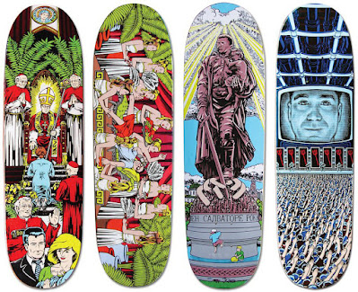
I would say the Randy Colvin Centerfold is where we really went off the deep end. Because that came out just before the Natas Devil board, which was another pretty wild one. Those two boards, coming out around the same time, really shaped our direction for a while.

How did the Fucked Up Blind Kids come to life?
Well, it obviously started with those old Garbage Pail Kids trading cards. I came up with the rider names. Steve came up with the “Fucked Up” part, because we couldn’t come up with an overall name. I just happened to say they were “fucked up”, and he goes, “Just call them that then.”
The idea to include cards definitely came from Steve. That came early on, probably before we even had it all fleshed out.
At first, there was talk of a “Raping Rudy”, but I didn’t want to use that. I didn’t want it to be too “tough guy” or anything, that’s why they’re all kinda silly names. “Rear End Rudy” is admittedly misogynistic, but it’s not some macho thing that someone would refer to themselves as. You would never want to be known by that nickname.
Like I said, I don’t know how much Jordan liked his graphic, but the rest of the riders were hyped. And they sold really well. I remember Megan getting calls from shops, saying that kids had “borrowed” their Mom’s car and driven an hour-and-a-half just to get these boards. That felt good.

Was there ever a Fucked Up graphic for Jason?
Yeah, I had an idea for Jason, because he was still on the team when I first started working on these. He was gonna be “Freebasin’ Jason”. Smoking cocaine, all burnt to a crisp. Kinda like what happened to Richard Pryor.
I’m sure that he wouldn’t have been into it but he ended up leaving anyway, so it never really came up for discussion.
You weren’t trolling Guy with “High Guy”, were you?
Well, it did end up becoming a bit of premonition, but he was only 14 years old at the time. I doubt he’d even drank a beer at that point. And I have to say, I made it a point to not be a “cool” drug. By no means is sniffing glue a glamorous thing.
But the way I drew that graphic was inspired by a Robert Williams painting. He did a painting in the ‘80s with a kid sniffing glue, building a model airplane kit. I definitely borrowed from that.

Was Accidental Gun Death based on anything?
The look is sorta based on Norman Rockwell. That was the vibe I was going for, but with a completely different type of scenario.
Figuring out the layout was probably the most difficult thing about that one. Because there’s a lot to put across there. Kids finding their dad’s gun and accidentally shooting their brother was a pretty common thing back then… before mass shootings started happened regularly.
Wasn’t the Napping Negro an actual painting first? Was that always intended to be a graphic?
Yeah, I did the painting first. That was one of the first times I ever used oil paints, that and Klein’s blackeye kid. But that was always intended to be a graphic.
I’m a little confused with how that board originally came about. Because for the longest time, I thought it came from Jovontae. I remember one time specifically when he came into the office with his Mom, he was carrying this postcard with a racially-stereotyped image of a black kid in a watermelon patch. The kid was urinating and it said, “The Fountain of Youth”. They showed it to Steve, who then showed it to me. In my mind, that’s what spurred me to do the graphic. I didn’t want to copy the postcard exactly, but still do something along those same lines of racial stereotyping.
But there’s also this other guy who would occasionally mail things into World, Neil Brown. He recently said that he sent in a similar postcard from a gas station in Alabama. So, maybe that’s the postcard I saw? I’m not exactly sure anymore.

The Thrasher ad goes a long way in clarifying your intent here, which was in the same vein as those Civil War Chess Sets that were always on tv…
Yeah, that was part of the inspiration, for sure. Another idea partially derived from after-school television. Steve wrote all that.
But I imagine that board still being quite problematic, especially with the internet where images get thrown around so haphazardly. I’ve heard that you regret doing this one, is that true?
I don’t remember saying that… and I can’t say that I regret painting it because I know what my intent was. But over the years, I’ve definitely felt like it’s been interpreted wrong at times. That certain people were liking it for the wrong reasons. Dave Chappelle mentioned something like this towards the end of his show, where he’d be making a joke about racial stereotypes and somebody in the audience was laughing way too hard at all the wrong parts. He said that it really made him think about what he was saying and how it was being interpreted… like, are people really getting this shit?
That’s definitely been a concern of mine with that graphic and a few other ones, that people aren’t interpreting it in the right way. But also, if you have to explain yourself, you’re kinda losing the battle anyway… which is basically what the ad was doing. You can’t always make someone read a full-page ad every time they see the board. That’s just not going to happen.
But I feel like of all the things to have included with these boards, that ad would’ve been most beneficial.
Yeah, or even as a top graphic. That would’ve worked, too. We just weren’t thinking about the potential consequences of things back then.

Is the Satan graphic just you trying to make the most evil thing ever?
Yeah, it was. (laughs)
But it’s also inspired by religious art. Because a lot of art from the Renaissance shows similar kind of things. Even in the Sistine Chapel, there’s the “Last Judgement”, which has a hell scene. Demonic imagery was a real component of religious art back then.

I feel like it’s your attention to detail that makes these boards classics, even if it is just flipping the graphic upside-down.
Flipping the graphic upside-down was just another idea that I wanted to see. Plus, I always felt like inverting it made everything seem more evil somehow. Like a crucifix, I guess. But that wasn’t the first time that had been done. Jim Phillips had a board on Santa Cruz with a panther graphic flipped upside-down. I think it was a Salba.
My favorite detail is probably that hanging guy wearing the Pope Hat… on the miter, it says “Pope Hat”. Because before I even did this graphic, just being bored at the office one day, we made a Pope Hat out of cardboard. I still remember Walter with it on, lifted up on the forklift as somebody drove him around the entire business park. There he was, two stories up, passing by the windows of all these other businesses with a Pope Hat on. It was the best.

I feel like that sorta thing must’ve happened every day there.
Yeah, I remember one occasion when Steve’s younger brother Sal decided to destroy Earl Parker’s car with a forklift. He was the warehouse manager at the time. He skewered Earl’s car with the prongs of the forklift and flipped it over. The fire department had to come and secure the whole area because there was gasoline leaking all over the parking lot.
Didn’t you say the warehouse was almost all women?
Oh, this was long after that. Because one of the women who worked in the warehouse got injured somehow and filed a worker’s comp claim against the company. I feel like that’s when Steve decided to become more of an equal-opportunity employer. (laughs)

Are you and Cliver just doing art non-stop here?
Yeah, because the turnover rate for product had gotten so much faster. You basically had to do a new board for people every month or two. And we had a lot of riders.
Cliver and I were working five or six days a week on graphics back then. We had our own keys to the office and knew all the alarm codes. We’d typically show up to the office a little later than everybody else and stay until almost midnight most nights. Coming back the next day.
How was it decided who did what graphics?
At one point, a formal decision was made that Sean would primarily do 101 graphics. Because he had done a few Plan B graphics early on, we got worried about all of the companies looking the same.
So how would you describe the difference between World, Blind and 101 graphics?
The main difference with Blind was that Gonz did a lot of the graphics. Mark definitely had more of a fine arts edge to the stuff he did with Blind. World was less in that artistic realm, with more of a comic and illustrative direction. 101 was a little less combative than World, too. Natas did a lot of artistic things back then that I personally found very interesting, like Andy’s grenade sculpture for Gabriel Rodriguez. Everything was being filtered through Natas, which made for a different sensibility than the rest.

Seemingly related to that grenade piece, what was the story of your bomb painting that ended up becoming a Gabriel graphic for 101? Wasn’t that Natas’ bomb? I seem to remember that thing showing up in a few 101 projects.
Yeah, Natas found that bomb at a store in LA that sells old military gear called “Supply Sergeant”. I guess it’s still around.
For the graphic, I just wanted to paint a bunch of cartoon WW2 era pin-up girls on it in acrylic, along with the Disney character “Pegleg Pete” from Mickey Mouse cartoons. I’m pretty sure Natas still has that thing in storage somewhere.

How did you feel about Cliver coming into the mix?
Looking back, it was very shrewd on Rocco’s part. Because take Powell, for example. They already had VCJ working in the art department, you didn’t see George trying to get Jim Phillips, too. Not that I’m comparing myself to those guys, but that was just Steve’s approach to things. To say, “Well, I guess I'll get another artist that’s good, too!”
I feel like most other companies would’ve just hired a few more freelancers or something. But in Steve doing that, it definitely served to keep me focused on things. I was far less likely to slack off now.
Would it ever get competitive?
No, because we were already friends before he started. It was more of a feeling that we were on the same team. And when you’re teammates with someone, you want to pull your own weight and keep up with the standard that your coworkers are at.
What’s funny is that we never really collaborated back then. We always worked independently of each other. Side-by-side, but always doing our own thing.
How critical would you guys be of graphics back then? Be it World’s or another company?
We were a little elitist when it came to graphics. I remember us getting real clique-ish when it came to Plan B back then. Looking back, I feel like that was mostly due to Plan B’s success at the time, where World and Blind were not what they once were. Gonz and Jason Lee were out the door, and suddenly, you have Mike Ternasky and Danny Way walking in. And they’re the shit.
Sean and I would always take potshots at their graphics… because we were jerks back then.
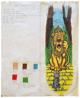
 |
| artist: not marc mckee |
To be fair, the early Plan B graphics were pretty terrible.
Yeah, I remember there being a Camel cigarettes rip-off for Sean Sheffey that we critiqued pretty heavily. For one thing, even if it would’ve been beautifully drawn, it’s lame to promote cigarettes in a straight way, but the artist didn’t even use a black line in the graphic! It was done in this weird ‘80s style with all neon colors and no key line. There's no black! It just looked so weird! And it didn’t look anything like the ads! I never understood that one.
What did you think of Ternasky coming to World? I know a lot of early riders saw that as a betrayal.
It felt like high school in a lot of ways, because you always had your different groups and cliques. I remember a Plan B team ad that just said “Jocks”… that’s kinda how it was. Plan B did feel largely at odds with everything we had been doing up to that point. They were consciously trying to be this super team, whereas World was a little goofier.
But the thing was, they were clearly killing it. You couldn’t deny that. The only thing we could poke holes in were the graphics. Like, how are you gonna portray Sean Sheffey as the cowardly lion crying? You can’t do that. That’s not Sheffey!
 |
| artist: carl hyndman |
Howard the Duck was pretty bad, too.
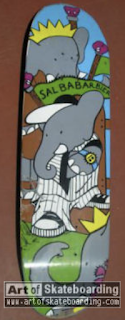
Sal Babar-bier! That was another random one, Babar the Elephant dressed in fly Starter gear. What was that?
 |
| artist unknown |
(laughs) Was there a rider who consistently came to you with good graphic ideas… or bad ones?
Well, it’s always easier to point out the bad ones: Dill. Because a lot of riders just want stuff that appeals to them, whether it’s a magazine cover or girls or whatever. One of Dill’s graphics was a cover of the New Yorker. He wanted it, so he got it.
This was also after they changed the pay structure and I started getting paid per-graphic. Because before that, I would just give Steve my hours and get paid, which meant I could work longer on individual graphics. For instance, I worked for 30 hours on the Barnyard, multiplied by whatever my rate was. And I got that, no questions asked.
By mid ‘94, I started getting paid a flat rate for each graphic. $500, $700 a graphic. Not matter how long it took, that was it. Rubylith and everything. So, because of that, I was more than happy to just copy a New Yorker cover real quick and get paid. Or an Alphonse Mucha poster, which was another Dill idea.
As an artist, it wasn’t always the most creative exercise, but I still had bills to pay.
What do you think of Fucking Awesome?
That stuff’s cool. You have to remember that Dill was a lot younger back then… And I always love seeing the word “Fuck” for sale, too.

But didn’t you do Klein’s Dream Girl?
Yeah, but that was before manga was such a thing. And Jeremy was really into that stuff back then, too. It wasn’t the New Yorker, you know? But you’re right, that was just a sticker he gave me to copy. I enlarged it and did the separations for it, but it’s basically a direct carbon copy of that sticker. And we got someone to translate Jeremy’s name into the katakana letters. The Japanese type.
I was never sure if that was his name or not. What about including Todd Congeliere’s phone number backwards in a graphic?
Yeah, I definitely put that in there without his knowing or permission. I just needed some numbers for the mugshot. And he actually did receive a few phone calls, which is pretty funny. People figured it out.

I’ve always felt your reinterpretation of Todd’s Icy Bear as the Rocco Devil doesn’t get enough credit.
Oh yeah, that was either Todd’s or Mike Smith’s idea. Rocco did not like that one. Rocco didn’t like it when people parodied his graphics. He wasn’t down with that at all.
There was another Liberty graphic by Daniel Dunphy. He was a freelance artist who did some stuff for us around that time. He drew a version of the mad tea party from Alice in Wonderland and put the Rocco Bear in there. Steve put the total kibosh on that one. It didn’t even get made.
What about the Rocco Glorification series for the Love Child pros?
That came from Sean and I. Because World was pretty big time by this point and Steve had become this polarizing figure within the skate industry, we thought it would be funny to come out with a series glorifying him with totally exaggerated praise. Just to rub some people’s nose in the fact that he was so successful. I don’t think Steve was all that comfortable with it, but Sean and I really liked that series.
Sean did the Russian statue one, but I had a book of Russian propaganda art and that statue was actually on the cover. It’s a soldier holding up a child, crushing a swastika underfoot. We just changed it to Steve crushing the Powell logo.
And the Shiloh graphic came from George Orwell’s 1984. More Big Brother imagery. But one thing that bugs me about that one is that it’s all white dudes in the audience. I should’ve tried to make my characters more racially-integrated back then. Like, that one would’ve been so much better if they were all lit up by the screen and everyone was a different shade of blue. Just to make it more diverse.

Did you see Rocco change with all this success?
We definitely had a dominant position at one point, but I never really saw much change in Steve because he always conducted his business with World as if it was this huge company. That’s why he chose a name like “World Industries”. He always wanted it to seem much bigger than it actually was. Bigger than a company with four employees and a forklift. So, when he actually did achieve real success, he’d already been operating with that perspective the whole time.
Did you see the Girl departure coming?
No, I didn’t see that coming at all. I think we were all pretty shocked by that... but I always felt the Bitch Skateboards thing that Sal and Steve came up with as a reaction was a step too far. I didn’t have any part in that.
Yeah, that was dumb.
(laughs) Yeah… I mean, women have a hard enough time as it is, you don’t need to have a picture of a woman with a gun to her head as your “Bitch” logo.
But stuff like that, when Steve set his mind on something, it was going to happen. It’s not like I was gonna be able to talk him out of it. It’s his company. Luckily, I was able to dodge working on it.

What effect did you see the Girl departure have on Rocco?
I feel like it was a real eye-opener for him. Because he was a little more distant with the riders after that. Not so engaged. He definitely wasn’t taking them all on shopping sprees anymore.
Do you personally think those guys were getting ripped off?
I don’t know. Because I’ve seen Mike Carroll in an interview where he’s like, “Who knows what really happened?” But then there are other people, like Tim Gavin, who's said that he did see some numbers that were off. I never saw anything like that.
I do think that it was inevitable with the type of environment Steve fostered. It was always total anarchy, so something like that was bound to happen. I mean, that’s how he formed his company to begin with, by taking Powell riders.

There must've been quite a shift at World, post-Girl.
Well, Steve was completely hands-off with graphics by that point. He was pretty checked out… All of his focus went to shoes. He worked primarily on Duffs after a while.
By ‘93 or so, shops just weren’t buying in the same numbers they used to, which meant that Steve no longer had as much power. Because at first, Rocco could strong arm shops into buying whole product lines. He had this blackball-type of policy where if shops wanted a graphic, they had to order this other graphic, too. But, unfortunately for Steve, there came a point where he couldn’t do that anymore. Shop owners were starting to say no and simply ordering boards from other companies.
There was a lot more competition by then, too. When World started, we had youth-oriented graphics that were largely lacking anywhere else in the late ‘80s. But all of a sudden, you had all these other companies coming up. We were no longer so unique anymore. And then Girl happened and all those guys left… which, even before that, with Jeremy Klein leaving for Birdhouse and Jason starting Blue, you could feel the beginning of a shift there. We couldn’t just slap anybody’s name onto some of these more controversial graphics anymore. The market was changing.
I remember riding in Steve’s Honda wagon one afternoon, going to lunch with him and Cliver. And I don’t know how we got on the subject of graphics, but Steve flat-out told us, “You guys gotta fucking stop doing this shit! It’s not selling!”
Because by that point, Plan B was coming on strong while Sean and I were still using that same type of “gnarly graphics” direction. The graphic in question here was a drawing that Sean had just finished of a nude woman with no flesh. (laughs)
Steve goes, “You gotta cut this shit out!”
Steve wanted no part of that one… I’m pretty sure that it became a Toy Machine graphic for Ed Templeton later on.
 |
| Rick Kosick and Marc's weirdest Big Brother-related predicament. |
How’d you become editor of Big Brother?
I nominated myself, basically. Because I worked on the first issue a little and had an interest in writing stuff. It was non-paid position, so I just kinda stepped in without anyone else having any say.
The magazine became another outlet for me. Because we couldn’t really do the gnarly graphics anymore, those were completely out of favor by that point. The riders no longer wanted them, Steve didn’t really want them and the shops didn’t want them. So, the gnarly graphics slowly morphed into the gnarly magazine.

Talk about the World/Foundation beef in ’93, which ultimately led to Rocco’s notorious Porsche ad with Richard Mulder. How real was all that?
Well, Swank and Rocco were always friends. In the very beginning of World, Swank would actually sleep under the desks in our art department. He would camp out there, back when we used to distribute Foundation.
Steve was always good about keeping business and friendships separate, but that beef was real. Because I’m sure Mulder’s leaving for World like that surely came as a surprise to Tod... but he must’ve known that Steve would respond when provoked. The only thing I can compare it to is the old East Coast vs West Coast battles in rap. It’s part publicity and marketing, but at the same time, it’s also very real. It’s kind of a blurred line.
But how did Rocco pull off that ad for Big Brother? Because I know you were editor at the time.
I’m sure Foundation gave us their ad first, which happened to be Mulder. I’m not sure if Rocco already had his eye on Richard or what… but yeah, then Rocco went out afterwards and shot Richard in his Porsche.
I’ll be honest… I don’t know. Yeah, I was the editor, but I was very much in my own world back then. Not really thinking about anything else whatsoever, just drawing away. (laughs)

(laughs) Wasn’t the “How To Kill Yourself” article Natas' idea?
I think that came from the girl Natas was dating at the time. As the story goes, I think she had either a friend or relative who committed suicide... Suicide was definitely something that had happened to them at some point, so they decided to write an article about it. I feel like it was her way of working through some things. Flipping it around as a way to deal with it.
What about Operation Manhood?
That one was all Steve. I don’t think Guy even knew about it beforehand, we just ran it.
This was during Steve’s brief involvement with the magazine, which I want to say he was done with by issue #4.

How much of a hand did he have in those early issues?
Just a few random ideas, like Operation Manhood or probably the Mulder thing. I would be surprised if he ever read any of the issues in their entirety.
Steve was all about the start-up. Once the magazine got up and running, he moved onto the next thing. Plus, it wasn’t a moneymaker. Not that Steve was all about making money, but Big Brother definitely was not a source on income in any way. It was actually the source of a lot of headaches, because there were constant problems with different riders and the content.
Like what?
One that immediately comes to mind is when I ran a photo of Kareem Campbell in the aftermath of him vomiting outside the window of our tour van. It was in an article I wrote about this UK trip we all went on. I went on the describe his alcohol intake that night in full detail, just trying to be funny. But he didn’t see the article until after it came out and was super bummed. I felt really bad about it, too. I tried to rationalize it by saying we showed people smoking weed in the magazine all the time.

Yeah, he was in the Bong Olympics!
He goes, “There’s a difference.”
And he was right, there is a difference. I’d much rather be photographed high on weed versus throwing up gin and juice everywhere. Weed was still illegal back then, too, so there was also a subversive element there. It was anti-establishment. You weren’t just making a mess of yourself at the bar.

Did you expect Rocco to sue Woodstock over that Big Brother ad?
Well, I knew that it was going to be in the magazine, but this was after we’d sold to Flynt, so I was pretty much out-the-door already when it came to the magazine. Part of me thought about warning him, but he found out about it anyway and had all the warehouse workers tear that page out before it was distributed. But I do think a few issues got out with that ad still in there.
I regret not telling Steve ahead of time… but in hindsight, if I had done so, my guess is that he would’ve been mad at for me ruining his plan to sue Simon Woodstock. Because I feel like he knew this was his big chance for an out-of-court settlement. That’s typically where his logic went with this sort of thing. (laughs)
But yes, it was hypocritical, for sure. I felt pretty bad for Simon.

How do you look back on the Flame Boy era? Because from an artist’s perspective, the products sold well and you got to develop an entire cast of characters… but unfortunately, a lot of people hated it, too.
I can see both sides of it.
It’s indisputable that World changed its entire image to focus on those characters, specifically. I don’t want to say that the soul of the company got tossed completely out the window, but there was a definite change from its early ‘90s heyday. The amount of commercialization surrounding those characters, it just kept snowballing. A lot of it was, again, tied to that change in pay structure. A per-board rate, not being able to do more elaborate graphics and the overall kibosh of gnarlier graphics. Suddenly, I was doing all these stick figure and happy face graphics, which is basically where those characters came from. Turns out that people like simple shit, so all that stuff took off.
Is it my favorite stuff I’ve ever done? No. But when it’s selling well, with the overall changing nature of the company back then, it’s hard to argue against.

Getting a nod from the Simpsons isn’t bad, either.
Yeah, that was pretty special. I knew that they’d contacted our office and gotten the okay to use our products, but it’s one of those things that you can only believe when you see it. But when it actually does happen, it’s pretty awesome. Because we even sent them a few graphics to use, but they ended up doing their own thing, which is even better.
But how was updating your old graphics with Flameboy and the Reaper? Was it fun for you to revisit these projects, or kinda boring?
There was a bit of that going on in the mid-2000s, like redoing the Powell Spoof series with the Reaper character. That was more a “last resort” type of thing. I was just out of ideas at the time and couldn’t really think of anything else. The riders liked those graphics, so that’s what I did. I can take those graphics or leave them. They’re just pictures on a board to me. A SKU needed in the product line.

What’s a famous board of yours that you don’t like?
I can’t really think of any graphics that I flat-out don’t like… I’m pretty self-critical of things before they go out.
There are definitely a few that I’d never want to put out again. The Lench Mob graphic I did, which was another Jovontae graphic. He didn’t want that at the time, he didn’t even know it was being made. And he doesn’t want to be associated with it now, either. I can see that, for sure. That one went too far.
In hindsight, redoing that Powell series with the Reaper didn’t need to be done. Reusing any of the old pro graphics, like reissuing Jason Lee’s Icons board for Creager? I probably shouldn’t have done that, either. It was never my first choice to have things work out that way.
What’s a graphic you wish you drew?
Probably that Evan Hecox series where all the riders have their own graphic, but together, it forms a panorama of the city. That was an awesome concept.

Who are some artists that have really stood out to you over the years?
I really like Aaron Horkey’s stuff. He did some stuff for Flip, some Lance Mountain graphics. His technique is just beyond.
And I feel like people are always surprised to hear that I like Neckface’s stuff. I’ve had friends of mine ask me, straight-up, “Why do you like that? It’s drawn so shitty!”
I don’t know, it just appeals to me.
I know you’re no longer at Dwindle, care to go into that? And what are you doing now?
Yeah, there was a restructuring in 2017 and I was laid off with a few other people. I’ve just been doing freelance work since. Not that I’m complaining at all, it’s all good. I have a few things in the works.

How do you feel when you look at current day World Industries? Having played such a crucial role in establishing this legendary brand for it now to be this weird zombie version of itself?
Well, it definitely prevents me from doing anything with those characters, because I wouldn’t want people to think I have anything to do with what’s currently coming out of there.
The company that owns World, they really don’t seem to know what they’ve acquired. Because Scott from PrimeWood has been paying them for the licensing on all the reissues he’s been doing… he said that they weren’t even aware of the ‘90s back catalog. No idea. And when they saw a few of the things that he released under the license, the old graphics, they were careful to eliminate any paper trail linking it back to their corporate name. They want absolutely no association with those boards, which is essentially what they bought. So, they clearly have no idea what they have.
So many have tried to copy what World did back then, why doesn’t it ever work? Why do you think World was so successful?
I just think that we were in the right place at the right time. Because in skateboarding, then and now, there’s that “already been done” thing. Once something works in the industry, it’s probably doomed to never work again.
You’ve produced an incredible body of work over the years, is it frustrating to have people constantly bring up these same graphics from 30 years ago?
Not at all. Honestly, I’m astonished that people still want to talk about this shit. But no, the ‘90s are a cherished period in my life, before all of my adult concerns set in. I didn’t have a thing to worry about back then. I just drew.
Big thanks to Marc for taking the time to do this.
Tip o' the hat to Sean Cliver and his incredible Disposable books.
so good!! so in-depth! Thank you so much!
ReplyDelete
ReplyDeletebest skateboard graphics of all time
Nice! Should talk to Cliver next
DeleteGreat interview… cliver and McKee were the art dream team back in the early 90s. Loved that world era. Wonder if he had kept a decent amount of his back catalogue from that era.
ReplyDeleteSo happy to see this today! Another great read, thanks to you both for taking the time.
ReplyDeletewell done Chopps
ReplyDeleteGreat interview! Thanks Marc for all you contributed to skateboarding. I skated so many boards with your graphics on them.
ReplyDeleteThanks for this! Really great interview specially reading about the stuff he got inspired from or use as reference makes me feel a little better with myself knowing great artist do borrow stuff too
ReplyDeleteDid anyone ever send any of those coupons in? And were there ever actual products made for them?
ReplyDeleteGreat interview thanks to Chops and Marc.
ReplyDeleteCool to see an AOS pic in there! Also, long back on AOS IG account, I posted the Penthouse and sparkplug reference pics as well for that "Sparkplug girl" graphic. Check it out! Love what you folks do!
ReplyDeleteArtofSkateboarding(dot)com
Have you talked to Laban yet? Would be pretty good. Blockhead was a fun company
ReplyDeleteInterviewed anyone from Invisible? Awesome ads and team. Jamie Thomas was on before he started Zero obviously
ReplyDeleteA Simon Woodstock interview would be sick. If you can find him roaming around San Jose
ReplyDeleteBeen reading for over a decade and another great interview! If I'm not mistaken, both Andy Jenkins and RL Osbourne were in Milk. Which I always thought was kinda odd, but with learning about the World and Bully connection, it makes perfect sense now. Thanks again Chops! Here's to another decade plus! (?):)
ReplyDeleteWhat's the significance of that last pic?
ReplyDeleteSatan graphics are okay, but any mention of racism is a step too far! Good to see they've all got principles!
ReplyDeleteMullen's trading card...if I recall it said that his disease was laughing. Wonder if the reaction to the barnyard graphic had anything to do with that? (Seems like he has keen sense of humor). Had a lot of those boards. A friend of mine bought that Jovontae board; was speechless when I saw it. And that was probably thee only Natas board I didn't buy. My Catholic mom, who hung a picture of Jesus by my room, would've probably fainted if she saw it.
ReplyDeleteAlways tried to puzzle out the connection with BMX and Spike and everything. Enjoyed the interview! (Nice photos too.)
Killer, in depth interview. Thank you!
ReplyDeleteMy wife put 2022's X-Games on while I was reading this. The classic World era couldn't seem more juxtaposed to the modern reality of skating. Marc and Sean's art and ideas were so fun and antagonistic. I miss that shit!!!
Amazing!! Thank you!!
ReplyDelete